The Power of a Proper North Star Metric
About eight years ago I wrote a post on the North Star Metric and it really took off. By “took off” I mean that it soared up the page ranks and landed on the first page of Google, where it oscillated amongst the top 5 spots for a very long long time. Until, that was, Amplitude and every other Product Manager who could write a sentence jumped all over the concept of a North Star Metric. Before I knew it, my post was relegated to the outer pages of Google and much of its content had been, well, either plagiarized to death or, as evidenced by Amplitude, disrupted with a very easy-to-understand framework.
So, I thought it was about time to dust off the post and take a different angle on it — especially in light of the fact that many other writers had improved upon my ideas and had altered the way I approach building a proper North Star Metric or set of North Star Metrics. Kudos to those writers for their research and their thought leadership on the differing styles and approaches to building and implementing a North Star Metric across a wide swath of industries.
Before we dive into the power of a North Star Metric or set of “motion metrics,” I want to get something out of the way — I know how dry and boring data and analytics content can be for most. If you’re here because you have to read this, don’t abandon ship. I’ll do my best to keep it light. If you’re a data junkie, hopefully you’ll gobble this up. Either way, buckle up because I’m going to peel back some important layers.
What you’ll learn in this post will give you the ability to make informed decisions through the lens of your North Star Metric. That decision-making prowess is why this specific piece of data is so powerful for your team to understand. But here’s the catch — I’ve seen companies of all sizes and calibers struggle to get this right. If you’re playing the guessing game around what your North Star Metric is and why that specific metric will act as predictable fuel for your company’s trajectory, you’re missing a huge opportunity.
Even though I’m going deep, there are a few things I won’t cover here. This might surprise you, but we won’t need to go down rabbit holes of financial modeling or predictive modeling. There certainly is a place for that and I could chew on those concepts for hours with you if you’re interested, but the reason I’ve chosen not to get overly analytical in this specific post is that it’s just not necessary. Instead, I’m going to focus more on something that’s not talked about nearly enough — using behavioral data frameworks to find your proper North Star Metric.
What is a North Star Metric?
The combination of accelerated technological innovation, intensified competitive pressure in almost every sector, and increased customer expectations on a brand have led most forward-thinking leaders to reconsider how they use Key Performance Indicators (KPIs) and metrics to guide their companies as a whole. Before we start to look at the frameworks used to find these units of measurement and the North Star Metric for your business, let’s first clarify what a North Star Metric is (and what it isn’t).
Here’s how I define the term:
The North Star Metric is a single metric — or set of motion metrics — that a company focuses on at each stage on the S Curve of Growth.
Pretty easy, right? Well, not so fast. A North Star Metric is a key indicator of long-term success for any company, and yet in order to ensure that it can be a guiding metric across a company as a whole, a North Star Metric should meet the following criteria:
- The North Star Metric needs to be easy to understand at every level of your company. This is first and foremost. (For larger enterprises, you’re going to have to build a set of mini North Star Metrics for each department that roll up into a larger set of North Star Metrics).
- The North Star Metric needs to reflect that “a-ha” moment of customer value. This “a-ha” moment is the place in time where a customer fundamentally gets the value proposition.
- The North Star Metric must lead to correlated growth of your North Star Goal. When the metric goes up, your revenue or profit (whatever your main North Star Goal is) will go up.
- The North Star Metric must be measurable and progressive. Progressive metrics change the way you act on the data and progressively move from leading to lagging. How much revenue you produce at the end of the month (lagging) is directly tied to all the inputs of efforts (leading).
- The North Star Metric should be tied to Lifetime Value.
In addition to the North Star Metric criteria, actionable input metrics should and could exhibit deeper connections to the data than just an absolute value. Here are some input best practices we recently deployed for a client that you too can consider:
- Comparative
- Attainable
- Behavior-changing
- Ratio/Rate*
*Inherently comparative in nature, think ratios like CAC:LTV
We’ll delve into these items in more detail further down the post, but one thing to keep in mind is that each input — when using the frameworks you’ll learn below — is intrinsically tied to core elements of your business like your culture, organizational structure, current, and past initiatives, and so on. StoryVesting inputs, in other words, are 100% subjective.
I hate to do this to you, but I’m not going to build a post around each of those criteria in the form of a listicle article (Step 1, Step 2, etc.) in less than 2000 words. Instead, I’m going to meander around for a variety of reasons to help reinforce these concepts through the lens of emotive and cognitive frameworks (like StoryVesting and the BowTie Why). There is nothing easy about business. It’s messy. It’s sloppy. It’s hard. This is because, as humans, we’re the element we’re trying to measure and we epitomize all that’s right and wrong with business outcomes and predictability. By meandering, I’ll be able to take you on a journey versus trying to convince you that formulating growth is so easy that it all hangs on one easy-to-understand habit/process/structure/piece of software, etc.
You get the point, so let’s move on.
The metric you choose to focus on is a quantifiable metric that reflects the amount of value that your company brings to your customers and wherein that value translates to repeatable, systematic growth. This single metric (or set of metrics, for larger companies and enterprises) gives direction to your company’s long-term growth versus short-term inputs and growth needs.
Looking at your North Star Metric alone isn’t enough. It’s a figure that needs to be powerful enough to offer a glimpse into how well your company is doing paired with how well your company is predicted to do in the future. That insight should drive your regular meetings and be continuously leveraged to fuel conversations around growth.
The idea behind analyzing this critical metric is this — when your North Star Metric grows, your company should grow, too. If your company brings more value to your customers, then the growth of your company goes positive. The assumption is that if your customers receive a lot of value, they will stay longer, buy more, and refer more people to your business.
There are instances where your North Star Metric can become problematic, however. If your North Star Metric grows but your revenues stagnate, it’s clear that something is amiss. In that case, the metric you chose and your revenue growth aren’t correlated. Taking that concept into consideration, let me ask you this:
Which metrics in motion, or which single metric, if it were to increase today, would most correlate with accelerating the growth flywheel effect of your business?
This isn’t an easy question to answer. Deciding which metric to focus on depends heavily on your business model, how your product or service is used, how it is marketed and sold, how it grows, and so on.
Let me warn you — if you came to this post hoping for a clear answer on the specific North Star Metric you should be using for your business, you’re in the wrong place. There’s no one silver bullet for all businesses. There’s not even a single silver bullet for all industries. It’s just not that easy. Understanding which North Star Metric you should use to track growth for your organization requires some deep diving into your business and customer experience layers via a behavioral framework. Yes, that’s right. If you don’t know how to build aligned Business Experience (BX) behavioral data into your data flows — those very flows from even the most complicated architecture and data stacks — you’re missing out on how to build metrics that truly matter to your growth.
Looking for hands-on guidance from our team on finding your North Star Metric?
Schedule Your Complementary North Star Metric Consultation
Leveraging Behavioral Frameworks to Find Your North Star Metric
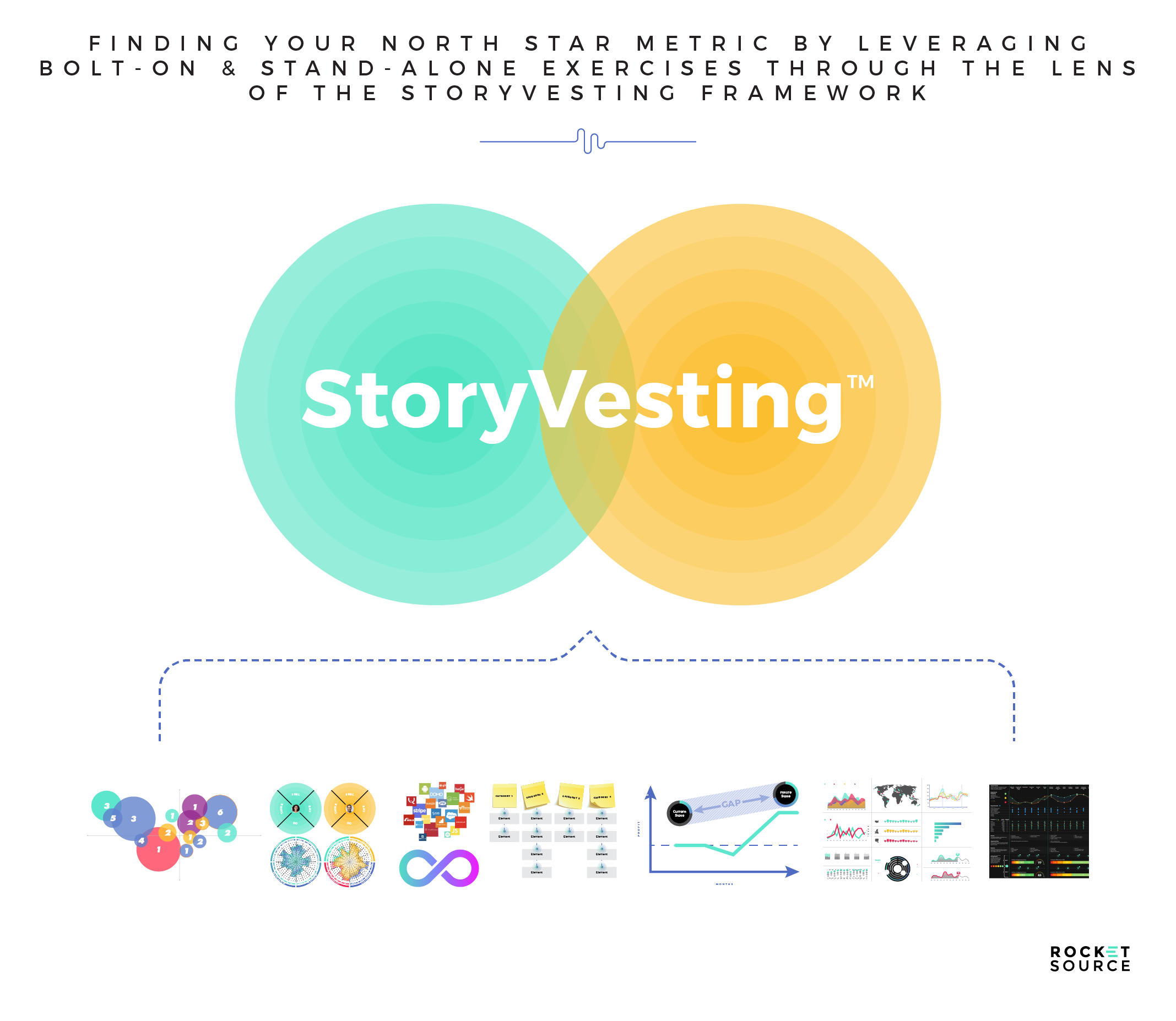
At RocketSource we’re advocates for simplifying the complex, and finding your North Star Metric is a complex tasks. I’ll get into why a little later in this post but for now, stick with me while I give you a glimpse into how I approach any complex decision-making process through the behavioral framework I’ve developed over my career, StoryVesting.
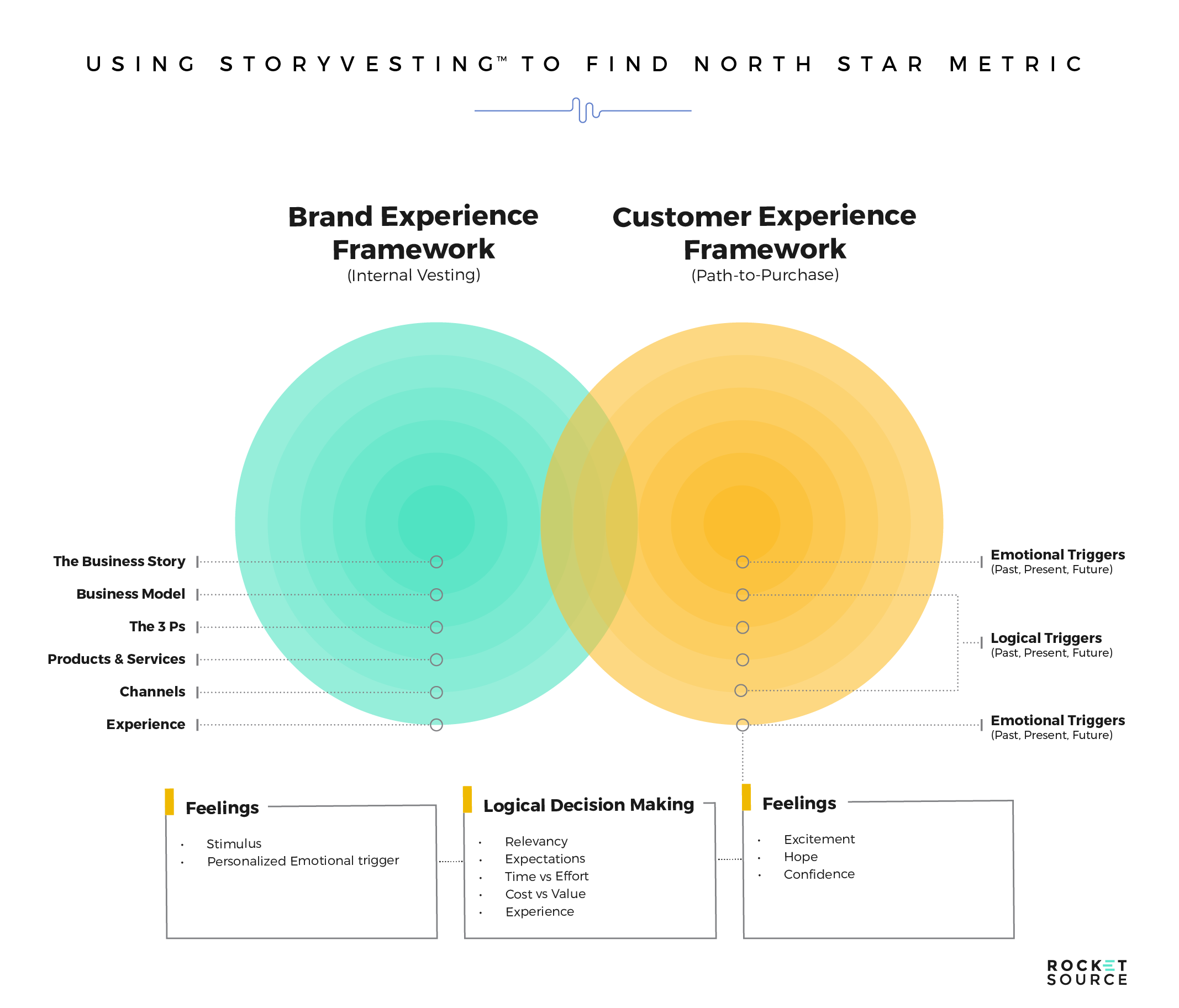
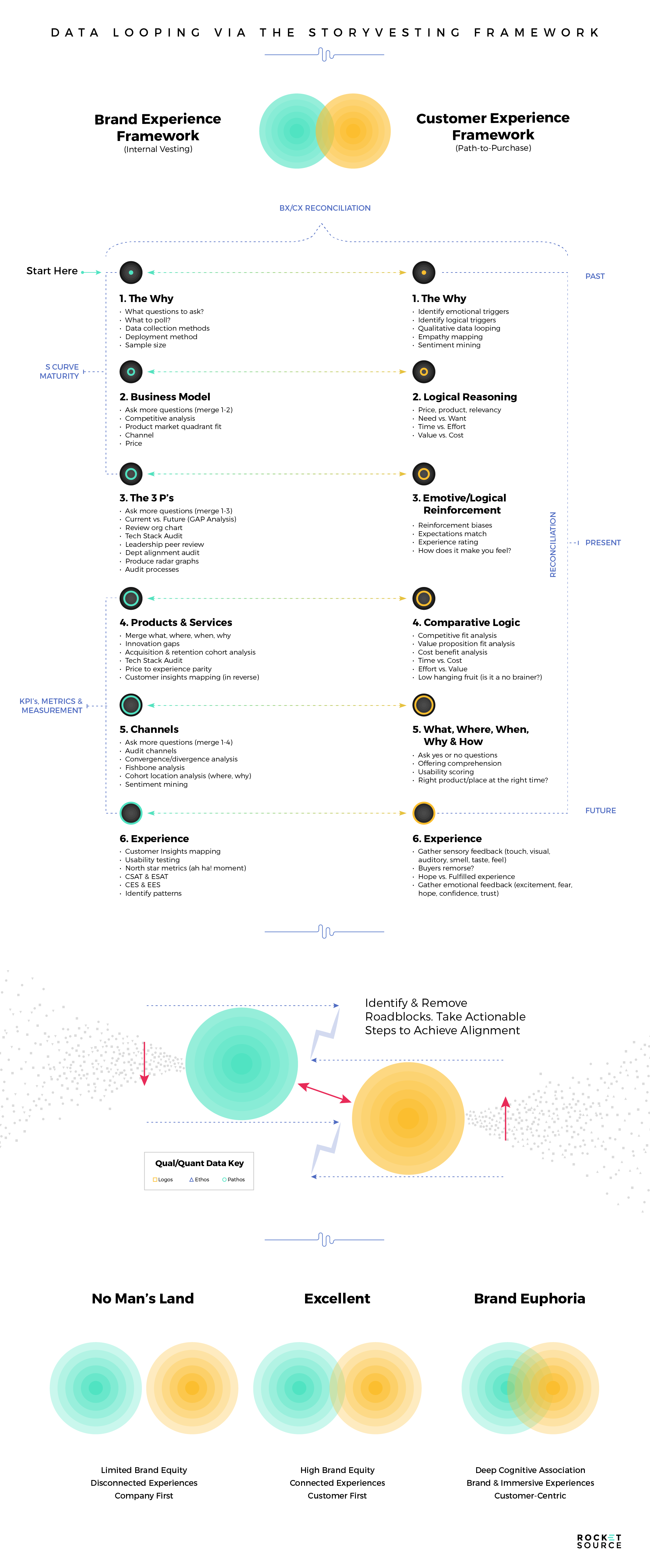
This framework is unique in that it’s made up of two core parts: the employee’s experience (seen here in teal) and the customer’s experience (seen here in orange). Layered within each of these concentric circles are the various layers of both your business and your customer’s journey. The goal is to get these two distinct circles to overlap as much as possible. The more closely aligned they are, the better the overarching experience will be for both your team and your customers.
As you can tell, StoryVesting is a problem-solving, decision-making framework driven by the alignment of internal and external behaviors. Behavioral data, as far as I’m concerned, is the best data one can collect. The nuances behind how people make a decision, the motivational triggers that inspire them to continue progressing in their journey, and the predictable nature of what one act means towards another are fascinating to me.
If you’re interested in the full backstory and nuances, I highly encourage you to save, or “Stack,” my article about how this business transformation framework came to be on Platstack. For now, here’s what you need to know as it relates to finding your North Star Metric.
StoryVesting Your Way to a North Star Metric
I’m a big believer in energy transfer. When one thing shifts, the energy from that shift creates a ripple effect that causes everything else to shift.
Neither businesses nor people are linear in nature. When we do things, there’s a multi-dimensional ripple effect.
That ripple effect most often stems from the center of our core experience in everything we do — our why. This concept of energy transfer is why I designed these concentric circles to represent the ripple effect that happens when something evolves or changes in any one of these layers, whether on the customer’s side or the organization’s side.
By recognizing the various impacts each layer has on the others, you’re able to gain a far deeper understanding of how your business and customers operate, and how that impacts your overall growth. More importantly, you’re able to assess how aligned your brand is with the customer’s needs, wants, and desires.
Peeling back each of these layers and looking at how they ebb and flow allows you to better understand which metrics will matter most to each experience and to your organization. This understanding is crucial when it comes to deciding on your North Star Metric.
But here’s the surprising truth. When analyzing other companies’ North Star Metrics, we’ve found that many businesses use different metrics than we would have used leveraging StoryVesting to uncover the best ways to monitor their growth. There’s one core reason for these differing end results — the companies we analyze are simply not asking the right questions of their team or market to drive closer to the center of the concentric circles and get to the sustaining virtue of the motivational why customers buy — or even the stickier version of why they stay. Instead, they’re often looking at the metrics that will allow them to exit their companies because they’re venture-funded or have PE targets to hit for Wall Street. While metrics with the end in mind can accelerate revenues to be able to make that exit or hit those targets, we prefer to look at metrics that can lead to predictable and sustainable growth instead.
Choosing a North Star Metric With Sustainable Growth in Mind
Where you focus your attention matters. Want evidence? Think about throwing a baseball. Where you focus your eye, the ball will go. It’s much harder to hit a target if you’re looking in another direction.
The same concept holds true for data and growth. The data that garner your regular attention will determine the trajectory of your company.
The right data is like predictable fuel that helps ignite your company’s growth. The wrong data will make you go around endlessly without ever closing the loop.
This type of directional focus is why nailing your North Star Metric — the top-line metric(s) that all company priorities are aligned around — is so crucial. Whatever your company chooses as your guiding metric will determine where your organization’s energy and brainpower will flow.
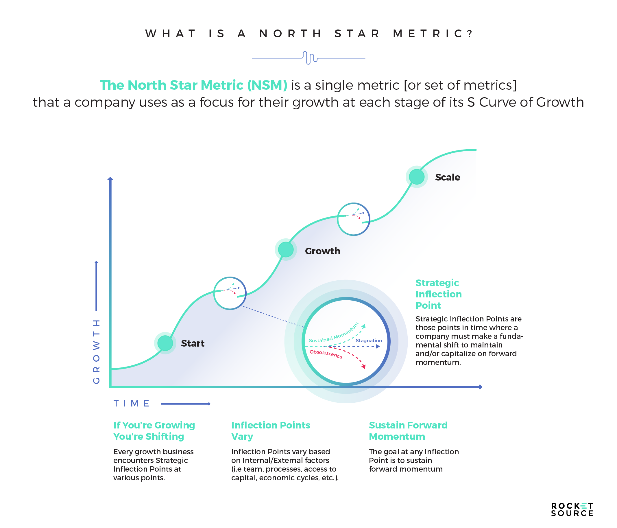
The process of finding the right North Star Metric to point your organization in the right direction is painstakingly hard. It’s not something you can sit in a conference room and brainstorm for about 20 minutes, and then have it nailed down. When done right, getting clarity on which metric to use as your guiding point can be hugely effective. It has worked wonders for businesses like Amazon, Apple, and Airbnb, especially early on. On the flip side, companies that do it poorly, half-heartedly, or even outright wrong put themselves in danger.
Focusing on the wrong metric for too long can cause your team to sacrifice growth due to short-term thinking, missed new opportunities, and sacrificed user experiences. It leaves your company wandering aimlessly, lacking focused energy to light a fire under your company’s growth.
In addition to choosing the wrong metric, focusing solely on one universal North Star Metric for larger or fast-growing organizations can be equally dangerous. Casey Winters, the former Head of Growth at Pinterest, put this eloquently:
The search for one key metric for a complex ecosystem like Pinterest over-simplifies how the ecosystem works and prevents anyone from focusing on understanding the different elements of that ecosystem. You want the opposite to be true. You want everyone focused on understanding how different elements work together in this ecosystem. The one key metric can make you think that is not important.”
Every single business has its own mission, audience, and set of operations. Likewise, each product has the same distinct purpose, cohort, and process for delivery. When searching for that one key metric, or a set of motion metrics, you must unravel which metric (or set of input metrics) will help you solve for growth up the S Curve of Business. To take on a task that big, you must start by laying a firm foundation of both outputs and inputs to better predict growth and recognize the ripple effects happening throughout your organization.
The Caveat for a North Star Metric
There are a lot of opinions about whether a fast-growing company or a larger enterprise can actually gain benefits from implementing this concept. And I say, ABSOLUTELY yes. But here’s the caveat for companies who are growing rapidly with multiple product SKUs/offers/etc., as well as for larger enterprises — and I’m going to put this sentence in bold:
A SINGULAR NORTH STAR METRIC FOR FAST-GROWING OR LARGER ORGANIZATIONS ONLY CAPTURES A LIMITED DIMENSION OF THE BUSINESS.
There, I said it. Instead, these types of companies need to look at a constellation of North Star metrics from department to department that roll into a larger North Star Metric across each division and then roll into North Star Goals — those 1-, 3-, 5-, or even 10-year big hairy audacious goals (e.g., $1.25/share estimated earnings, $10mm ARR, 100,000 new subscribers by December 31).
A North Star Metric is an output metric that represents a result, whereas input metrics represent actions and drivers of work that result in a final output (e.g., growth of X, Y, or Z.). Output metrics are lagging whereas input metrics are leading. More on that later. For now you’ll have to remember that, when selecting which metrics to focus on, you must get granular at differentiating between output and input metrics (use a Fishbone process) and which inputs actually correlate 1:1 on the output. For organizations that fit these criteria, keep in mind as you read this article that all the frameworks and suggestions I go over will still have validity whether it’s one or many. It just takes more management and cross-departmental/cross-functional alignment to arrive at the metrics to showcase the right levers.
Is your head spinning? We’re here to offer a complementary North Star Metric consultation during which we can help you get clarity around your unique business challenges when it comes to finding the right constellation of metrics for your organization.
Schedule Your Complementary North Star Metric Consultation
Laying the Foundation for the North Star Metric
I’ve read a lot of books over the years about predicting growth. One book that I continuously pull off my shelf and dig into is Ahead of the Curve by Joseph H. Ellis. In this book, he talks about the art and science behind data.
At RocketSource, we’re huge advocates of leveraging gorgeous data visualizations to merge that art and science of data together. This artistic and scientific approach is especially important as you consider how next-generation predictive algorithms are infused into daily business processes, planning, and design. It’s these new algorithms that are driving the desire for next-generation digital dashboards, especially those driven through the lens of Lifetime Value (LTV).
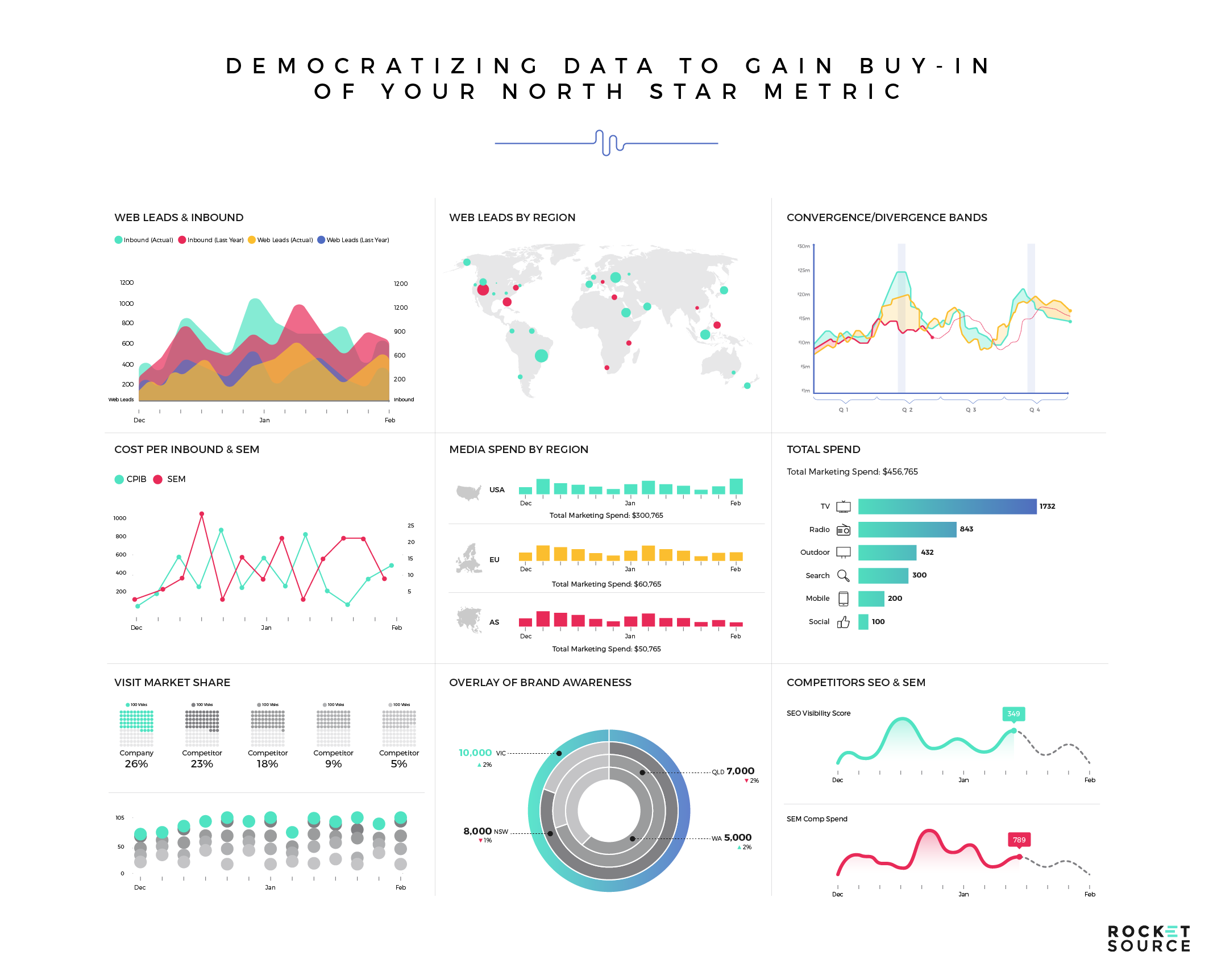
When you consider the predictive nature of KPIs and prescriptive market indicators, it becomes clear why this is such a big need among teams. Dashboards, such as the one shown above, provide more than a rear-view mirror retrospective. They become assets that can transform organizations into data-driven companies. It’s that data-driven posture that can empower an organization to reconvene their KPIs to enjoy distinct competitive and growth advantages.
Having a similar means of visualizing data around your North Star Metric makes it possible for your entire company to see how each project, process, or tweak they make impacts the greater goal. To get there requires that you have insights into multiple metrics. Having multiple pieces of data you’re watching, rather than one singular measure, enables you to better predict your future trajectory and posture your business for growth. But it’s not just any metric that you should tack onto your data dashboard. Monitoring and understanding both inputs and outputs from the North Star Metric equip you to lay a growth-oriented foundation.
To give an example of what monitoring the inputs and outputs from your North Star Metric looks like in practice — and why it’s so important — consider how Spotify analyzes their North Star Metric and the inputs and outputs that direct the company towards the main goal.
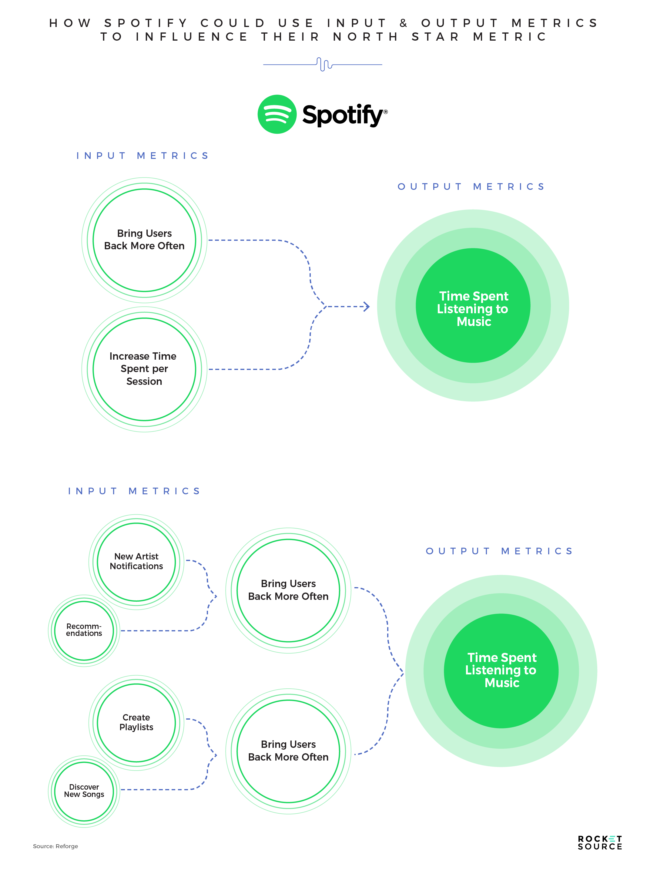
Spotify is a music and podcast streaming service. They know that in order to increase revenues, they must increase the time spent listening to music and/or podcasts on their platform. This output metric makes sense because it directly impacts how likely a person is to stay with their service or leave for a competitor. Still, there’s one problem with choosing listening time as the North Star Metric — it’s a lagging indicator, meaning that this data point only adjusts after it’s too late to make any strategic changes and save a sinking ship.
In order to get out ahead, Spotify would need to also monitor other input metrics, which could be tweaked and analyzed to predict the impact it would have on their North Star Metric — the time spent on their platform. Increasing time spent on their platform requires two things: (1) bringing back their user base more often, and (2) increasing their users’ time per session. In order to bring users back more often, they focus on infusing new processes that will inspire their customers to return, such as highlighting new artist notifications and offering recommendations. Once their audience returns to tune into the new material, they keep their audience on the platform longer by creating deeper playlists and making it easier for their users to discover new music.
By working backward from the single North Star Metric and analyzing or democratizing the input metrics that drive the output metric, their entire company is able to understand the why, how, and what behind their platform. Even though their North Star Metric is technically a lagging indicator, it’s still able to be the guiding point for the input metrics that need to be monitored to predict future user behaviors.
Surprisingly, many companies take the opposite approach. They start by designing initiatives without ever really knowing where they’re headed or why that’s the direction they’re going. When you take this approach, it makes reaching an unknown destination much harder. Your teams fail to be vested in the why because they can’t understand how their roles play into a greater good. There’s little understanding about what will spur forward momentum and what will stall growth.
To showcase the challenges it can impose when you don’t have the North Star Metric decided upon, let’s look at another example. Consider what would happen to Facebook if they took an input-first approach.
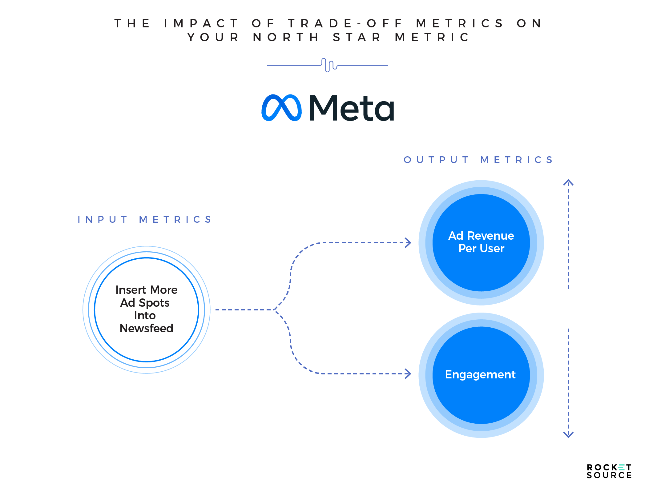
Pretend you’re a fly on the wall in a Facebook conference room. Someone asks a growth manager to increase ad revenues. The solution they come up with is to insert more ad spots into the newsfeed. After all, having more ads shown should equate to more revenue per user, correct? In theory, yes. And, in actuality, it might increase revenues short term. The problem arises when another output metric is considered: engagement. As more ads get put into the newsfeed, engagement might decrease, which could decrease overall ad revenues.
Understanding these tradeoff metrics, or the motion of shifting each metric, is non-negotiable. Remember earlier when I mentioned the ripple effect each concentric circle has in StoryVesting? The reason that’s so powerful is that to predict growth you must understand the residual impacts of the decisions being made at every level of the organization. To do that, you must choose the right North Star Metric to know the path you’re taking, and infuse data visualizations that will showcase what happens when you pull various levers to try to push upward on the S Curve of Growth.
What Makes a Good North Star Metric?
By now, you’re probably scratching your head wondering what your output metric should be and what inputs your company should monitor. If you’re hoping this is the part of the post where I’ll do a big reveal of specific things for you to add to your data visualization dashboards or your team’s monitoring list, I hate to say this, but you’re out of luck.
There’s no shortage of metrics you could monitor for your business. What’s important is that you don’t fall into “status quo” categories. In our work with clients, here are some commonly used metrics that, as far as we’re concerned, just aren’t quite deep enough:
While these metrics have value, they’re lacking one major element — that ah-ha factor. Tracking Lifetime Value (LTV) has a purpose, but it won’t help customers or employees truly feel, in their bones, why a product is offered and why someone would want to pay for it. A North Star Metric, on the other hand, is a measure of that ah-ha value and a better predictor of why people come back time and again.
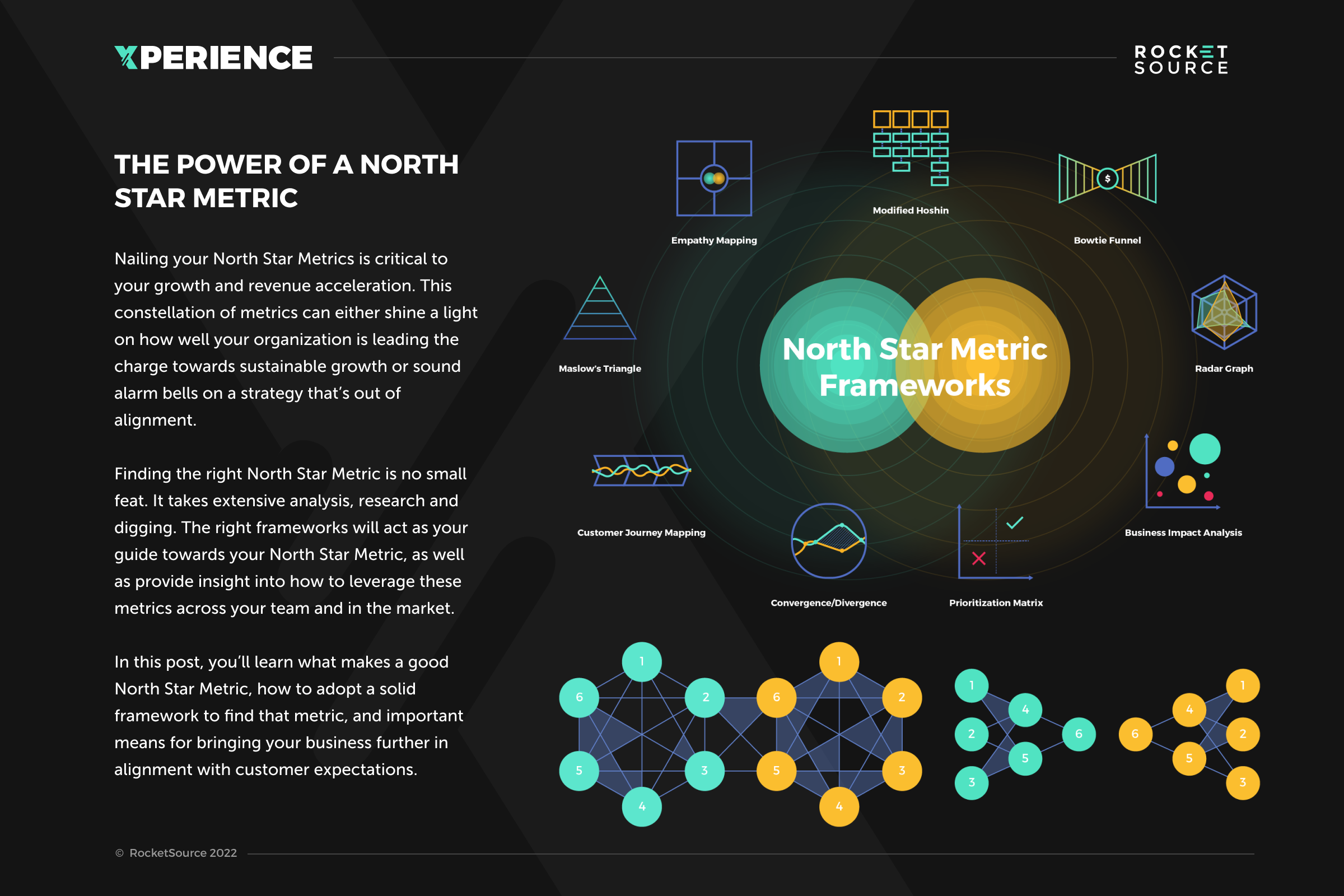
To understand what your North Star Metrics should be, consider this very simple approach used by Amplitude. For the life of me I don’t understand the logic behind their numbering, but I must say that it’s an easy-to-digest analysis/framework to start with so that by the time you delve into more robust, rigorous, and sophisticated frameworks like StoryVesting, the BowTie Funnel and the Customer Insights Map, at least you’ll have a good starting point.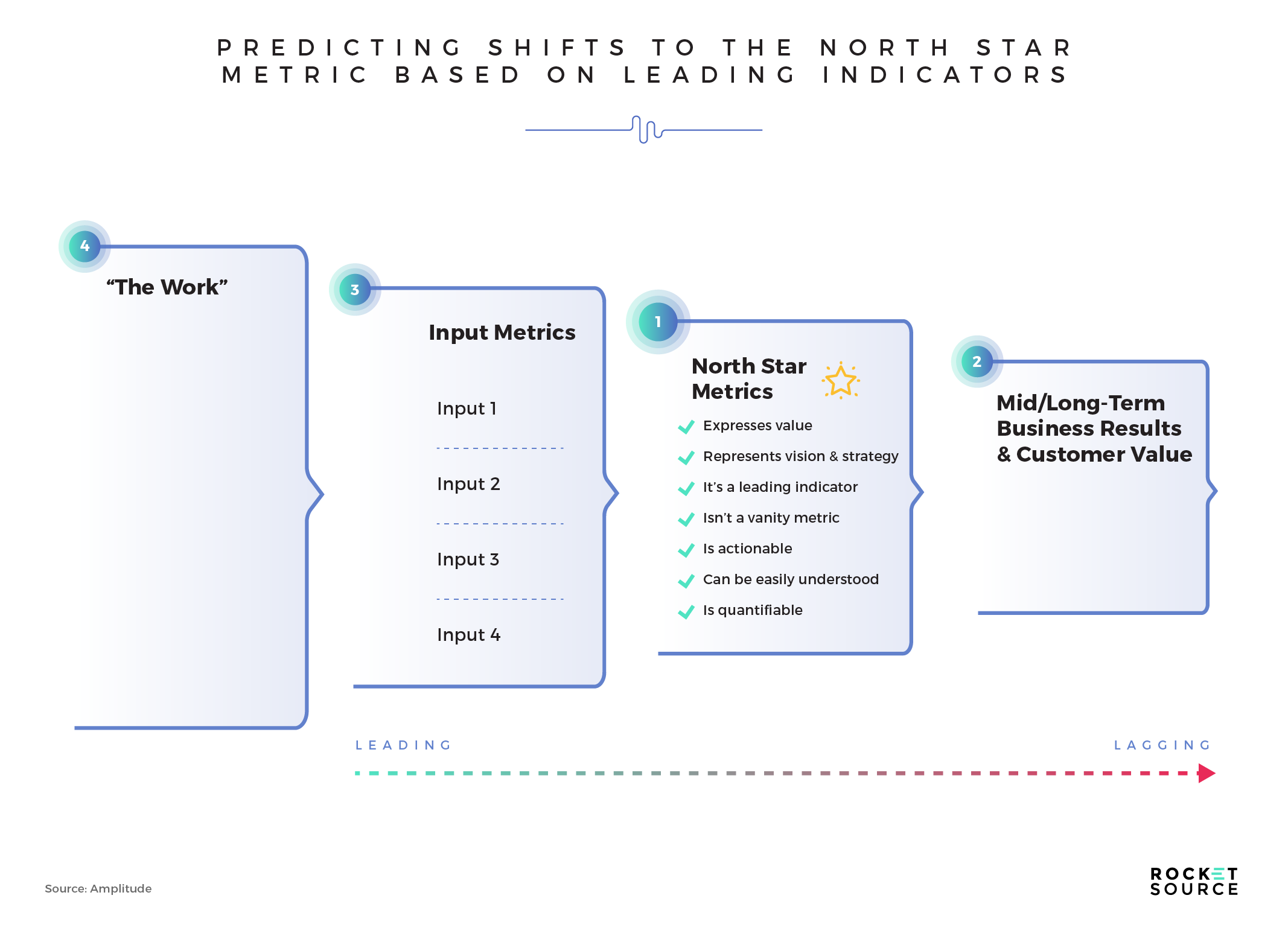
In this format, you can see that a North Star Metric will express value, represent vision and strategy, be a leading indicator, not be a vanity metric, be actionable, be easily understood, and be quantifiable. Let’s look at each of these briefly on their own.
Expresses Value. A quality North Star Metric will showcase the value to the business and to the customer. For example, if you’re an app looking at Daily Active Users (DAU), that shows value to your business and value that the customers feel when returning to your app day after day.
Represents Vision and Strategy. Your North Star Metric must align with the why of your company. If it doesn’t, it won’t adequately answer how well your business is doing in reaching your core goals.
Leading indicator. Monitoring a lagging indicator won’t alert you to the important nuances of what’s happening with your customers and in your business until it’s potentially too late. Watching leading indicators will help you right the ship faster and keep you on course up the S Curve of Growth.
Not a Vanity Metric. Vanity metrics are those found at the top of the bow tie funnel. They’re the ones that show how many leads your business is getting or how many deals you’re closing. Simply put, businesses that are solely focused on numbers that inflate their image won’t last long. Vanity metrics, such as number of followers or customers, don’t tell a story about what happens after a person buys or illustrate their lifetime value with your business.
Actionable. Your team must be able to influence the movement of your North Star Metric. For example, an app developer would want to choose a metric that can be shifted by strategy, features, or new in-app benefits.
Easily Understood. Your entire company must be able to look at your North Star Metric and understand what it signifies. In this way, you’re able to keep all departments in alignment and moving toward a goal they can resonate with. If the goal is too complex or hard to understand, your teams won’t be able to see how their work influences that end goal, making it harder to help find innovative and transformative solutions.
Quantifiable. Despite popular belief, the best data isn’t merely qualitative. It’s qualitative data that’s quantifiable. That means that you must be able to attach some sort of figure to your North Star Metric to enable it to be tracked without allowing opinion or cognitive biases to influence the outcome.
Those are a lot of factors to consider when choosing a North Star Metric, but each of them distills down to this:
Your North Star Metric is what will drive that ah-ha moment predictor for your company.
To better understand what this looks like in practice, let’s look at an example of a subscription-style application that delivers dog toys and treats each month.
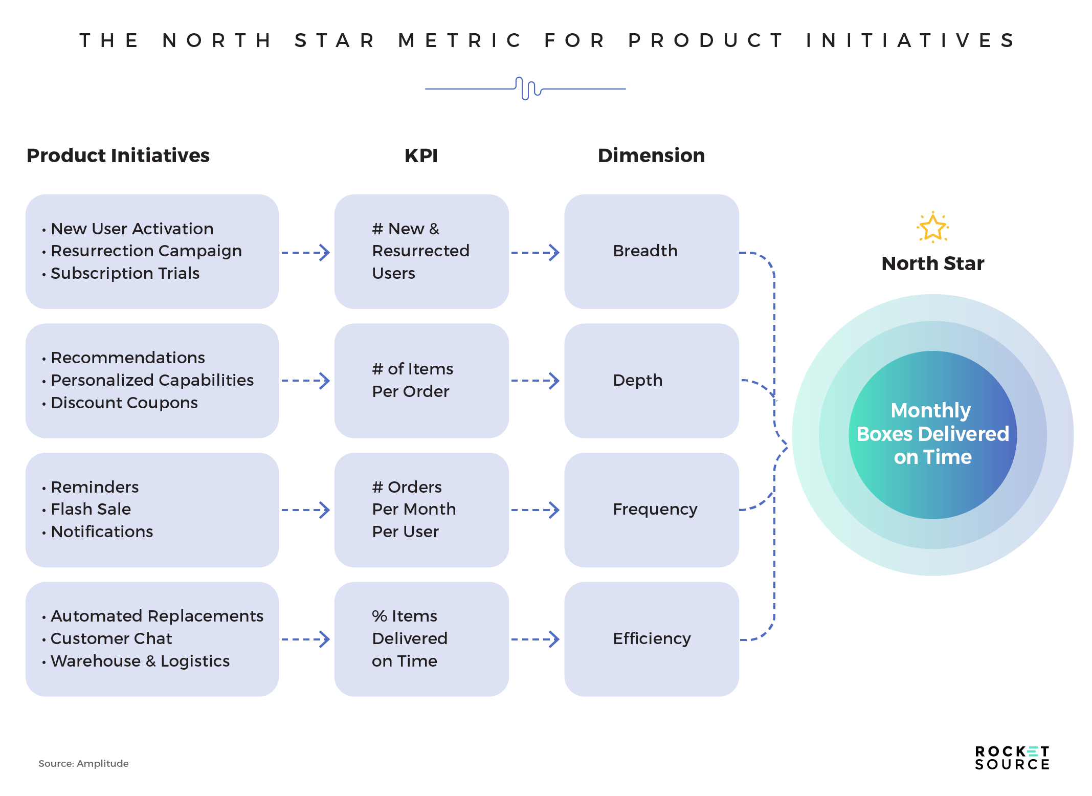
In this example, the subscription box company is looking at how each product initiative inputs some sort of actionable Key Performance Indicator (KPI) or metric. For example, if your product initiative is to add in-cart recommendations, personalization capabilities, and discount coupons, you’ll want to look at the Average Order Value (AOV) to understand their influence. Beyond that, you’ll understand the depth of each order, which will help lead you to the North Star Metric of the monthly boxes delivered on time to subscribers.
Retrospective and backward-mapping your way from a product initiative or a new marketing strategy will help you look at specific and actionable metrics and dimensions to get deeper into what your North Star Metric should be for your specific business, goals, and model.
The Most Common North Star Metrics
I’ve said it before and I’ll say it again — there’s no one-size-fits-all approach to finding a North Star Metric. Still analyzing what other companies are tracking might help spark new ideas or new ways of thinking about your own business.
As food for thought, consider these more relevant North Star Metrics for some of the biggest companies in the world.
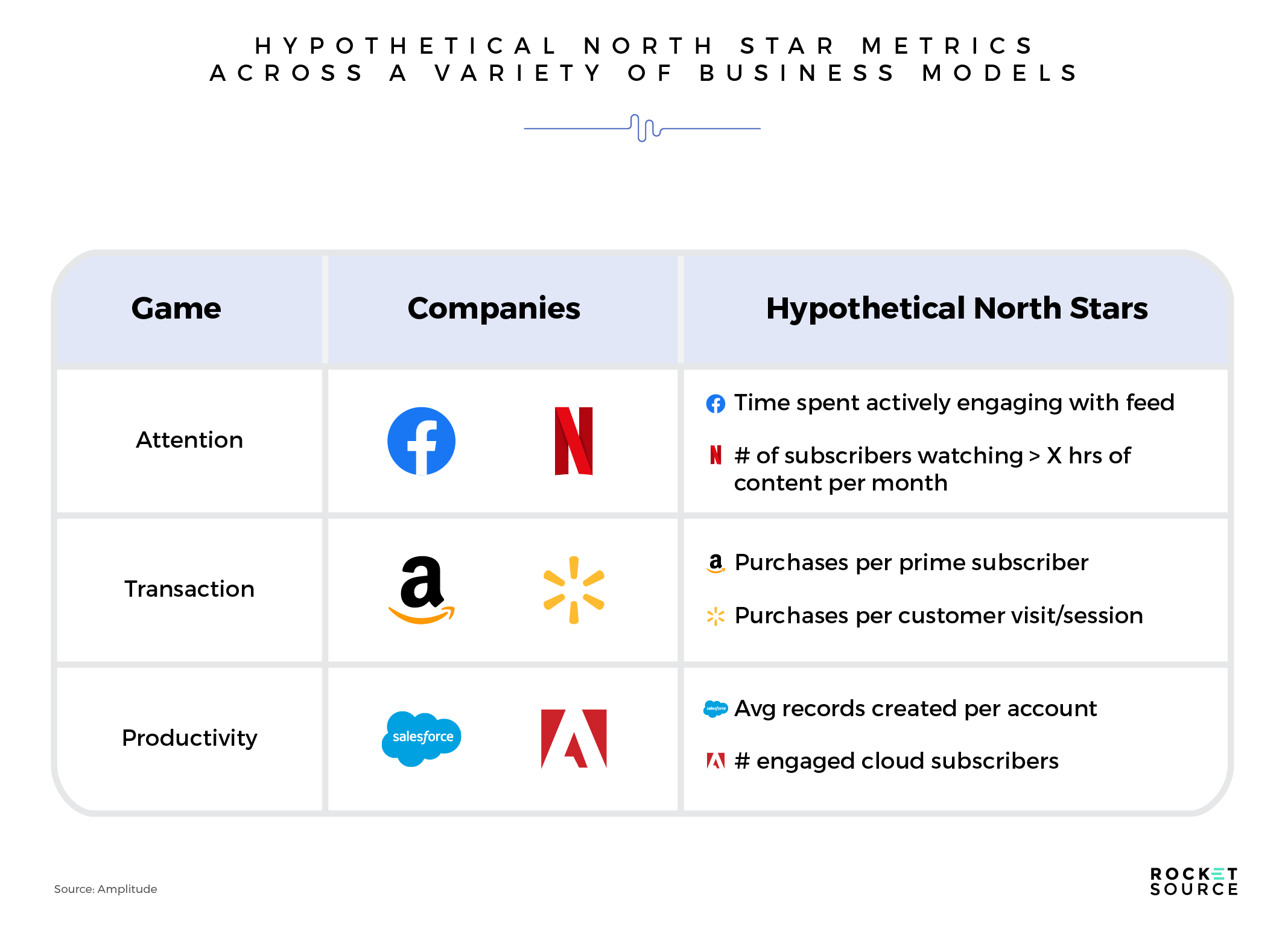
These may or may not be their actual North Star Metrics but I wanted to give you an idea of what’s possible. It’s surprising, but more often than not, when we look at North Star Metrics for other businesses, we find that what they’re using isn’t what we’d recommend. That’s because we go about analyzing things a little differently via the StoryVesting framework. For example, for years Facebook (now Meta) has been focused on Daily Active Users. Given their recent shifts, I see a stronger North Star Metric for Facebook to track to ensure it remains a sustainable platform: time spent engaging with the feed. This new vantage point will offer more depth to the metric and show Facebook how long they’re holding their users’ attention rather than just how often users are logging in.
Another good example is Amazon. Rather than looking at the Average Order Value (AOV) as many online retailers do, I’d recommend digging deeper into their core customer base and looking at the number of purchases per Prime subscriber. This deeper approach would help the company focus more on power users and how much revenue they’re spending, making it clearer where to put resources.
The Business of Metrics
I think it’s clear by now that metrics are important. They hold us accountable. They keep us aligned and moving forward. Just like your weekly sprint meetings in which you recap what you accomplished the previous week and then decide on what you will do to keep moving ahead, having a set of departmental input and output metrics, plus that one North Star Metric keeps those guardrails up.
In other words:
Metrics help report progress, change behavior, and guide decision-making.
When used properly, metrics provide key insights into your business and show you where and how you need to change in order to improve. Those insights can become the difference between success and failure — a statement I don’t make lightly.
As our capacity to track everything increases and the tools to do so become easier to use and more prevalent, the question remains — which metrics are worthwhile to track? Identifying key business metrics isn’t easy. It takes a lot of navigating. When done right, however, it’ll keep you from wandering aimlessly through the trees.
Before you can really figure out which metrics are worthwhile to track, it’s important to understand the basics of metrics. Believe it or not, there are good numbers and bad numbers. Some numbers don’t help at all while others can save the day. It’s through understanding your analytics that you can lean towards the latter rather than the former.
Analytics is the measurement of movement towards your business goals.
Think about analytics through the lens of patterns in data. You don’t want to set off on an aimless trajectory. Your goal should be to consistently progress towards the goals you’ve set out to accomplish. If you don’t know where you’re going, metrics aren’t going to be particularly helpful to get you to a predictable outcome.
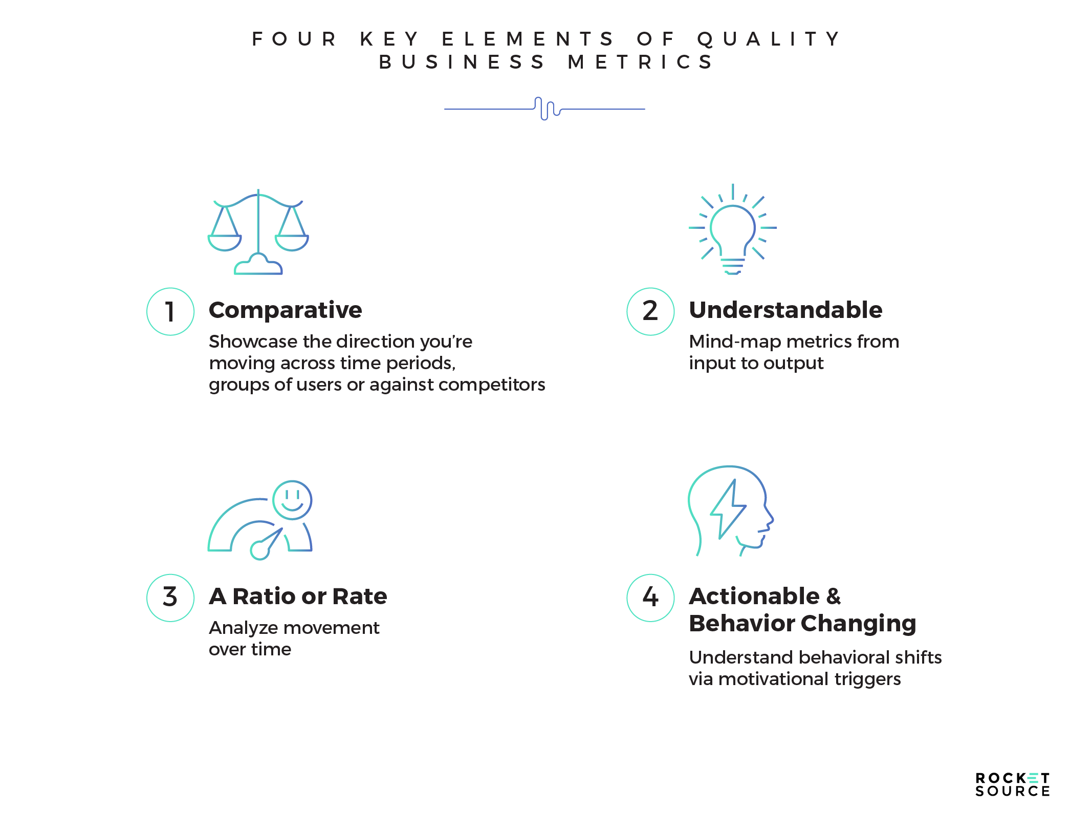
As you’re working to identify a good metric, remember that ALL metrics you’re using, from your North Star Metric to the input metrics that influence that North Star, must have four key elements — comparative, understandable, a ratio or rate, and actionable or behavior changing.
There’s quite a bit that lies underneath each of those areas, so stick with me as I unpack each one.
Comparative Metrics
Your business is constantly in motion, so the metrics you use to understand your trajectory on the S Curve of Growth need to be able to showcase which direction you’re moving from one week to another. To do that, the metric must allow you to compare what’s happening across time periods, groups of users, or competitors.
For example, think about your understanding of what’s happening in your company if you’re in a meeting and a team member says, “we increased conversions by 10% from last week.” That statement is more meaningful than something like, “we’re at a 2% conversion rate.” Nobody cares about the conversion rate. They care about the motion of data from week to week.
Using comparative metrics speaks clearly to our definition of “movement towards business goals.”
The more savvy you are at speaking in comparative metrics rather than absolute metrics, the more growth-oriented and growth-minded you’ll become. You’ll be able to tell your team a better story with your data. That story will showcase how each team’s efforts have impacted the organization towards a core goal. More on that later, but for now let’s keep moving with what makes up a good metric.
Understandable Analytics
At RocketSource, we’re advocates for and experts at simplifying the complex. When it comes to which metrics you should be tracking in your business, we believe that they should be understandable rather than overly complicated.
There’s a simple test that will determine the understandability of your analytics. Show the numbers you’re tracking — the ones you feel are most important to your business’s success — to someone outside your business. If they don’t instantly understand your business and what you’re trying to do, then the numbers you’re tracking are probably too complex.
Another test you can do is to try fitting your key metrics on a single computer screen. There’s a catch, though — you must do it without using a super small font (that’s cheating!). If all of your metrics don’t fit, you’re either tracking too much or the numbers you’re tracking aren’t effectively telling a story about the movement of your organization towards its goals.
If people can’t remember the numbers you’re focused on and discuss them effectively, it becomes much harder to turn a change in the data into a change in the culture.
A Ratio or Rate
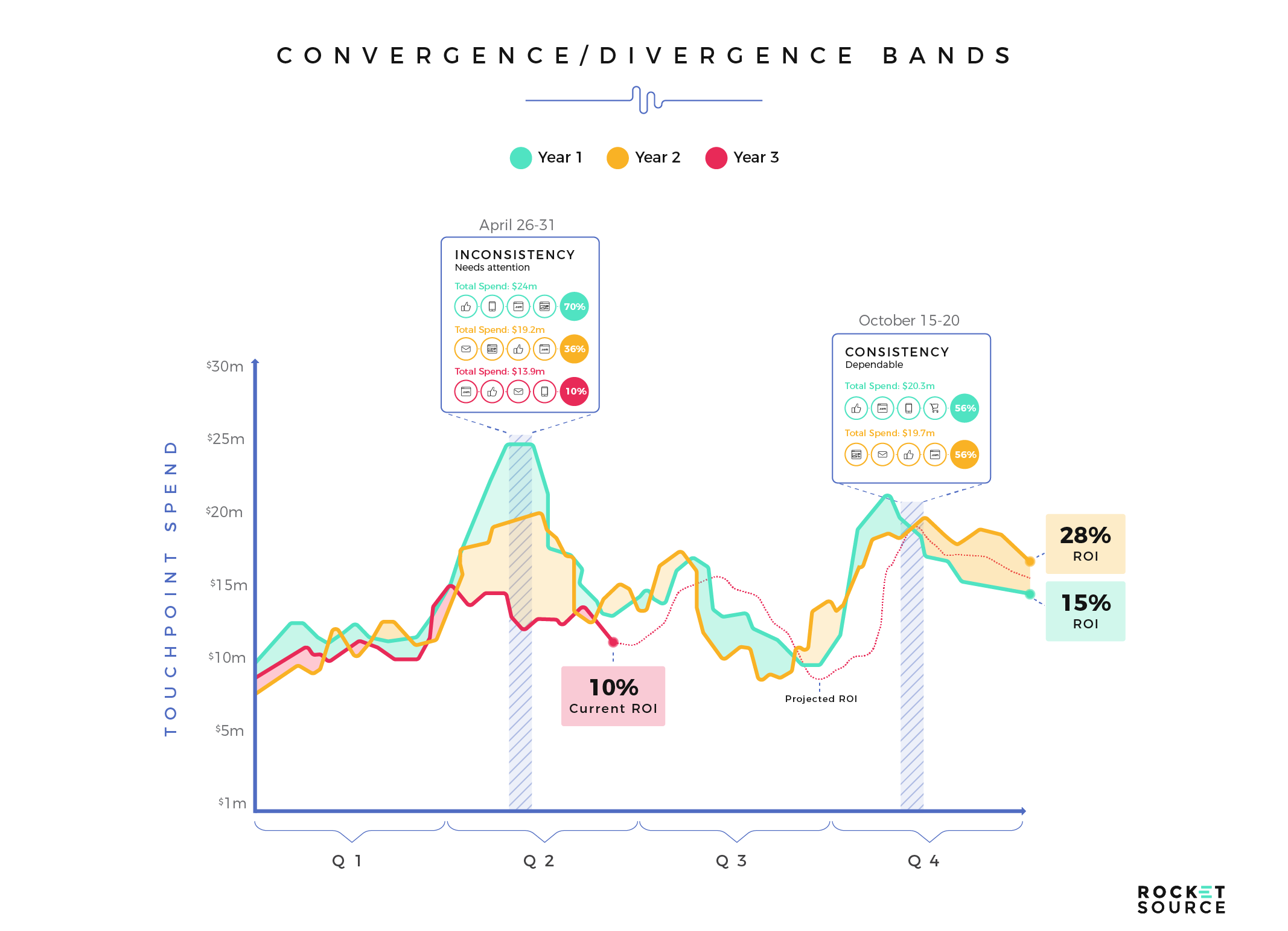
Ratios and rates are all about motion and leverage. They’re also inherently comparative. For example, if you compare a daily metric to the same metric over a month, you’ll see whether you’re looking at a sudden spike or a long-term trend. You’re looking at the motion over time.
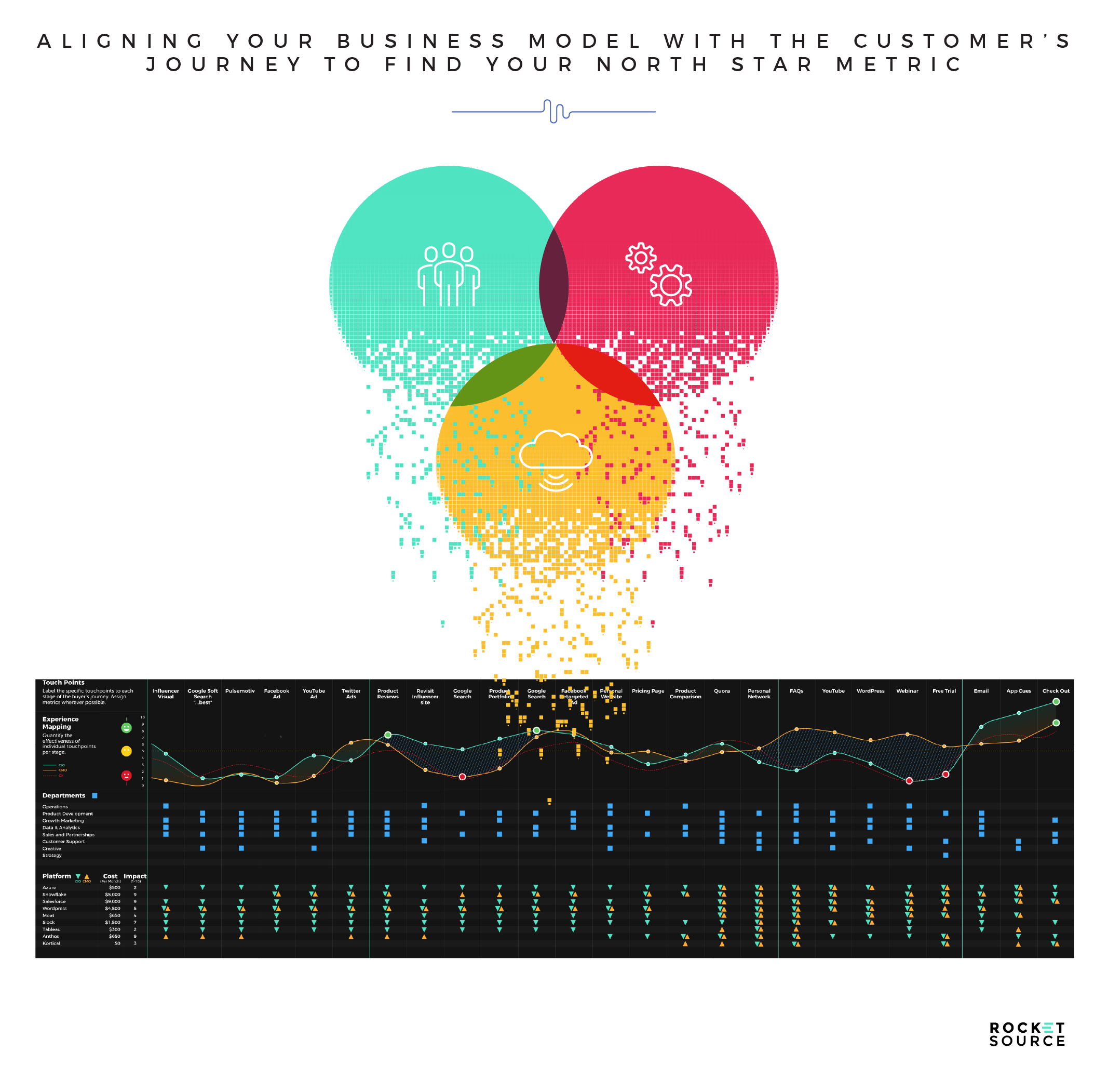
Ratios and rates (unlike absolute numbers) give you a more realistic health check for your business. As a result, they’re easier to act upon. This inspired action is a huge reason why we put convergence/divergence bands on our Customer Journey Map.
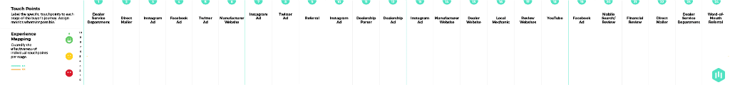
What you’re looking at here is a Customer Journey Mapping (or Customer Insights Mapping, as we like to call it) exercise that we developed at RocketSource. This particular section of the map leverages something I took from my days on Wall Street — convergence/divergence bands (my team lovingly refers to them as Barlow Bands). These bands showcase the ratio or rate between the customer’s experience score and the employee’s experience score. Let me give you an example of how I use these with our clients.
Whenever I go into an organization, I start by asking the leaders of that company questions such as these:
What are YOUR biggest leadership and team issues that YOU face today in:
- Finding and recruiting enough skilled workers?
- Aligning common goals?
- Team ability to execute consistently?
- Adapting to a hybrid workforce?
- Not being able to build connected teams?
- Effectiveness of cross-team communication and collaboration?
- Effectiveness of delegating tasks?
- Navigating change?
- Measuring performance?
I then take their answers and follow up with the employees. Once we have that data in hand, I can then visualize the gaps between the two scores. The green circles in Figure 1 represent the leader and the blue circles in Figure 2 represent the employees who report to the leader. This is another example of how I visualize those convergences and divergences so teams can quickly see where something is amiss internally.
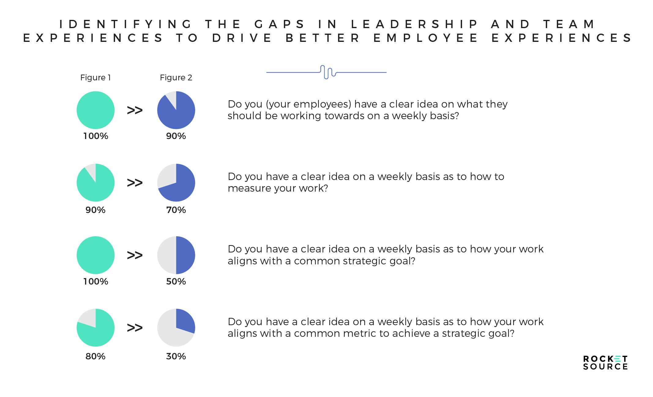
One reason (and there are many) I like to compare this data is that it allows us to see massive gaps between human behavior and how EX and CX are actually represented on the ground floor. Those gaps could signal a deep problem in People, Process, and Platform (3Ps) alignment, and can quickly be identified and then rectified.
As we talk about business goals, ratios and rates help you understand if you’re heading towards those goals or away from them. Having visuals and metrics to compare and contrast what’s happening in specific areas of your business or customer’s journey will help you identify where you can improve and where you need to focus your resources.
Actionable and Behavior Changing
Someone once said that the definition of insanity is doing the same thing over and over again and expecting different results. You don’t need me to tell you that an insane approach is no way to operate and grow a business. Therefore, the metrics you track must inspire some sort of change in behavior if they are to make a difference. This is by far the most important criterion for a metric:
What will you do differently based on the changes in the number?
Data and analytics are the raw ingredients of KPIs and metrics. Surges in data volume, velocity, variety, and ongoing algorithmic innovation will require organizations to continually revisit the fundamental elements and attributes of their KPIs and metrics. Therefore, leaders should consistently be asking questions such as:
- How will access to new data alter expectations around enterprise measurement?
- How will mobile customer touchpoints affect how marketing measures engagement and experience?
- How will data governance change as real-time access to data and analytics evolve?
KPIs’ special class as a data asset will become even more important as they become an input into Machine Learning algorithms and process automations. You can call this “the great KPI inversion.” Tomorrow’s top managers may start asking whether they’re better off using KPIs to inform and manage their people or training their machines and automating their processes. In either case, data capabilities that support more complex KPIs and metrics will likely become a source of competitive advantage in the years to come, which can alter our behaviors moving forward.
Which Business Metrics Should We Track?
Understanding the behavioral and future process nuances behind these key metrics begs the question — which business metrics should you track? If you’re not sure how behaviors will change as a result of tracking a specific metric, then it’s a bad metric to rely on. Notice I didn’t say you shouldn’t track it at all. It’s good to track as much as you can! But typically, we suggest tracking everything yet only focusing on the set of core metrics in motion that are directly correlated to growth. You never know when a metric you’re tracking becomes useful unless you track it and yet if you track everything as “critical” or “core” then you end up digging holes in all the wrong places.
When looking at the key metrics you’re focused on today, see if they pass the insanity test. Ask yourself if you know what you’d do differently if those figures went up, went down, or stayed the same. If you don’t know, put those metrics aside and look for better ones to track right now.
Very simplistically, here are five key elements we may opt to take into consideration when helping our clients choose what to track (like I’ve said before in many posts, every business and organization is different and requires different inputs).
Qualitative vs. Quantitative Metrics
As I said earlier, the best data is qualitative data that can be quantified. Qualitative data showcases behaviors and human motivations. It’s more emotional in nature and harder to put a number to. Qualitative data, however, is anything you can track numerically. It’s used more often to understand what’s happening and visualize broader trends.
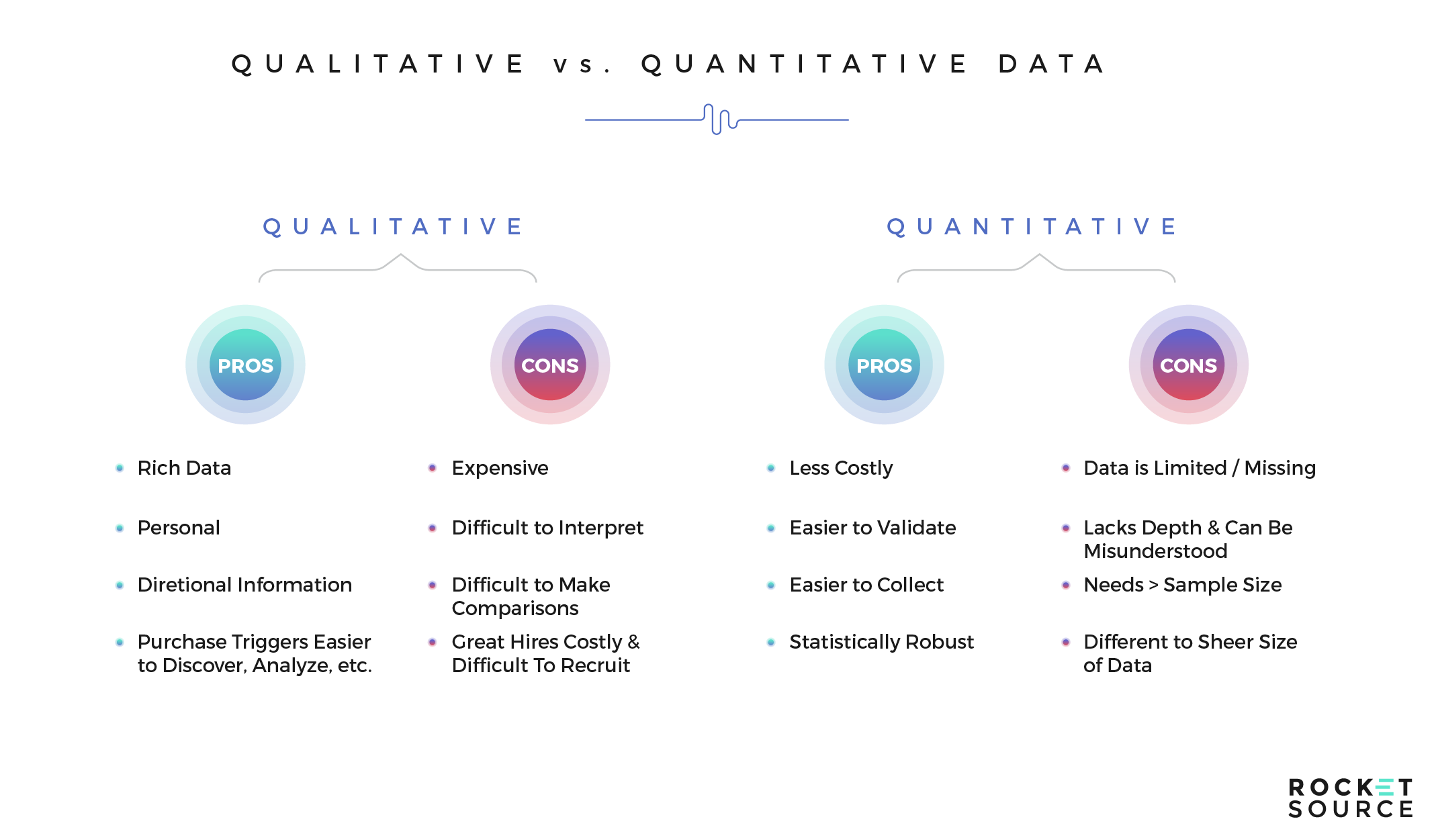
Both sets of data serve a purpose, and both have their pitfalls. While qualitative data is more expensive to obtain, it’s richer and more directional. Quantitative data lacks depth but it’s easier to collect and more statistically robust.
As you choose which metrics to track in your business, lean towards the metrics that have a happy balance between qualitative and quantitative insights.
Vanity vs. Actionable Metrics
When you look at business growth, how often do you start at the back of the funnel? I’m not talking about the point of conversion. I’m talking about retention driven from the back of the customer journey funnel, or Bow Tie funnel.
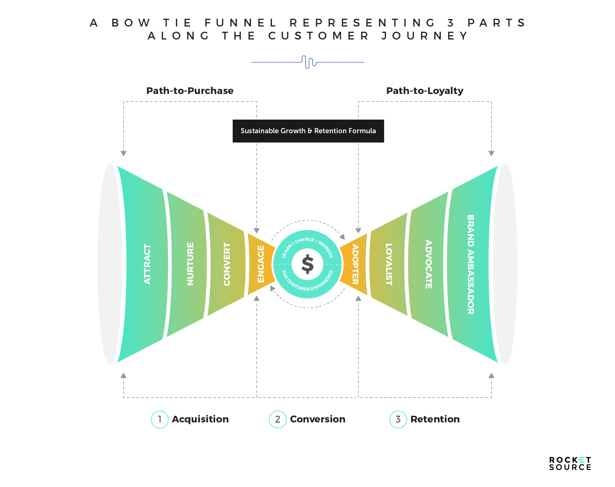
This customer journey funnel has been tipped on its side from what you might be used to seeing. While the front of the funnel — attract, nurture, convert, and engage — is likely familiar, what happens immediately after a person buys from you is less often considered but is, in my experience, more powerful. This includes the adoption phase, where they’re onboarded and form their first impressions, and the retention phase, where the customer starts to build brand loyalty. It also includes the expansion phase, when the customer builds trust in your business, and the advocacy or ambassadorship phase, where the customer is more likely to share their results from your business with their friends (the ultimate win is for your business).
You’ll be lost if your business is only focused on the top of the funnel. You won’t drive predictable outcomes because you’re starting at the wrong spot. By starting with retention first, and forming your North Star Metric around the back of the funnel, you’ll have more actionable metrics fueling your decision-making. Those actionable metrics will ultimately filter to the top of the funnel, building those vanity metrics everyone knows and loves.
Exploratory vs. Reporting Metrics
Reporting metrics are straightforward. There’s no grey area with these. Think about the most common statement in a business — the profit and loss statement. This is a reporting mechanism that lets you know if you have a viable business. Often, reporting metrics showcase what’s happened as a result of an experiment, but they don’t showcase any lightbulb moments that have changed the trajectory of the organization.
While having reporting metrics is undeniably important, these metrics don’t let you know what you can explore within your business to effectively shift behaviors.
Exploratory metrics are those that allow you to peel back the layers of what a customer is doing in your business, as opposed to simple metrics that give you the end result. For example, engagement inside a membership or on your application’s dashboard can shine a brighter light on the behaviors of a customer and what they want out of using your product. Exploratory metrics are deeper and more impactful to your organization’s success long-term.
Leading vs. Lagging Metrics
Most organizations kickstart their analysis using lagging indicators. That approach makes sense on the surface. Oftentimes, lagging metrics are all the organization has on-hand. For example, looking at churn rates will often tell you the longevity of a customer. While that’s important data, it’s lacking in one important thing — the timeliness of answering that churn problem with a solution to help stop the bleed.
Leading indicators showcase what happens just before a major change occurs. They’re predictors of future behavior. If you monitor leading indicators, you can get out ahead and change behaviors by implementing strategic changes to your organization’s strategy.
Both types of metrics have their place in business growth. When considering your North Star Metric, it’s important to lean more toward a leading indicator so you can get out ahead of any problems before they arise. To give a good example of this, consider headwinds versus tailwinds.
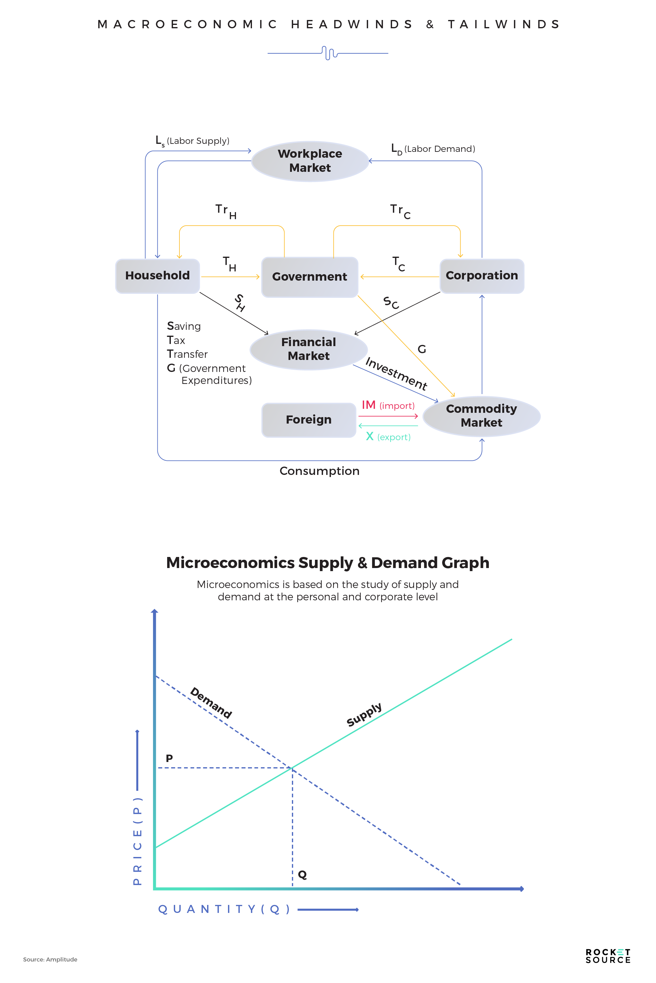
Typically, macroeconomics studies the performance of the factors that affect all of us based on a national or global perspective, such as when we’re headed into a recession. You need to understand the macro headwinds and tailwinds if you want to get really good at building models around the right metrics. Without knowing we’re in a recession or are going into a recession, it’ll be hard to predict the price elasticity of supply and demand. If you don’t really know where your supply and demand are in equilibrium, it’s very difficult to actually grow your business because you can’t forecast demand — and you certainly can’t produce enough supply if you can’t forecast demand.
Every single business in the world has to look at headwinds and tailwinds through macro and micro forecasts using leading and lagging indicators. In the example just given, a leading indicator could be the consumer price sentiment index. A lagging indicator would be the recession, because those metrics are usually brought up six to nine months after the recession actually starts. If you really want to get good at forecasting accurately, you have to get your finger on macro versus micro tailwinds, and to get there you must know what the leading and lagging indicators are in your business.
Correlated vs. Causal Metrics
Correlation and causation are different. Correlation means that there’s similarity between two metrics, but that doesn’t mean that a change in one metric will lead to a change in the other. Causation means that a change in one metric will change another metric. One causes the other, so they ebb and flow together. I like to look at these this way — if you get really good at developing a North Star Metric, and you’ve experimented on it with an n500 or n1000, only then do I believe you can start applying causal effects to those metrics.
Understanding these differences is important. While correlations between multiple metrics offer predictable fuel, causation can help you get out ahead and make changes before something goes awry and gets your organization off course. Even though causation isn’t always direct and an event can have multiple causes, knowing the causality of two elements can help you be more forward-thinking and forward-acting.
Wielding StoryVesting and Other Frameworks to Think, Solve, and Decide for Your North Star Metric
I started learning about North Star Metrics from a guy named Alex who, along with Chamath Palihapitiya from Social Capital, was head of growth at Facebook about 13 years ago. That growth team attracted the best and brightest data engineers, standard engineers and product engineers that the world has ever seen. I think we can all agree that Facebook data is the best data on the planet when it comes to driving predictable data from your spend.
Every minute, Facebook tracks 136,000 uploaded photos, 510,000 comments, and 293,000 status updates. The data they have on hand based on these user interactions is so remarkably accurate and powerful because those engineers took the time to dig into behaviors building lookalike audiences, tracking cookies, and even using facial recognition. It is phenomenal what they can do with that data. They wanted to get to a model where their ad revenue would be completely justifiable based on these causal metrics, which they did a great job of doing, but none of that would’ve been possible without having a framework rooted in behavioral data.
StoryVesting is a framework that takes similar behavioral principles and data and applies them to help organizations mitigate problems with aimless measurement.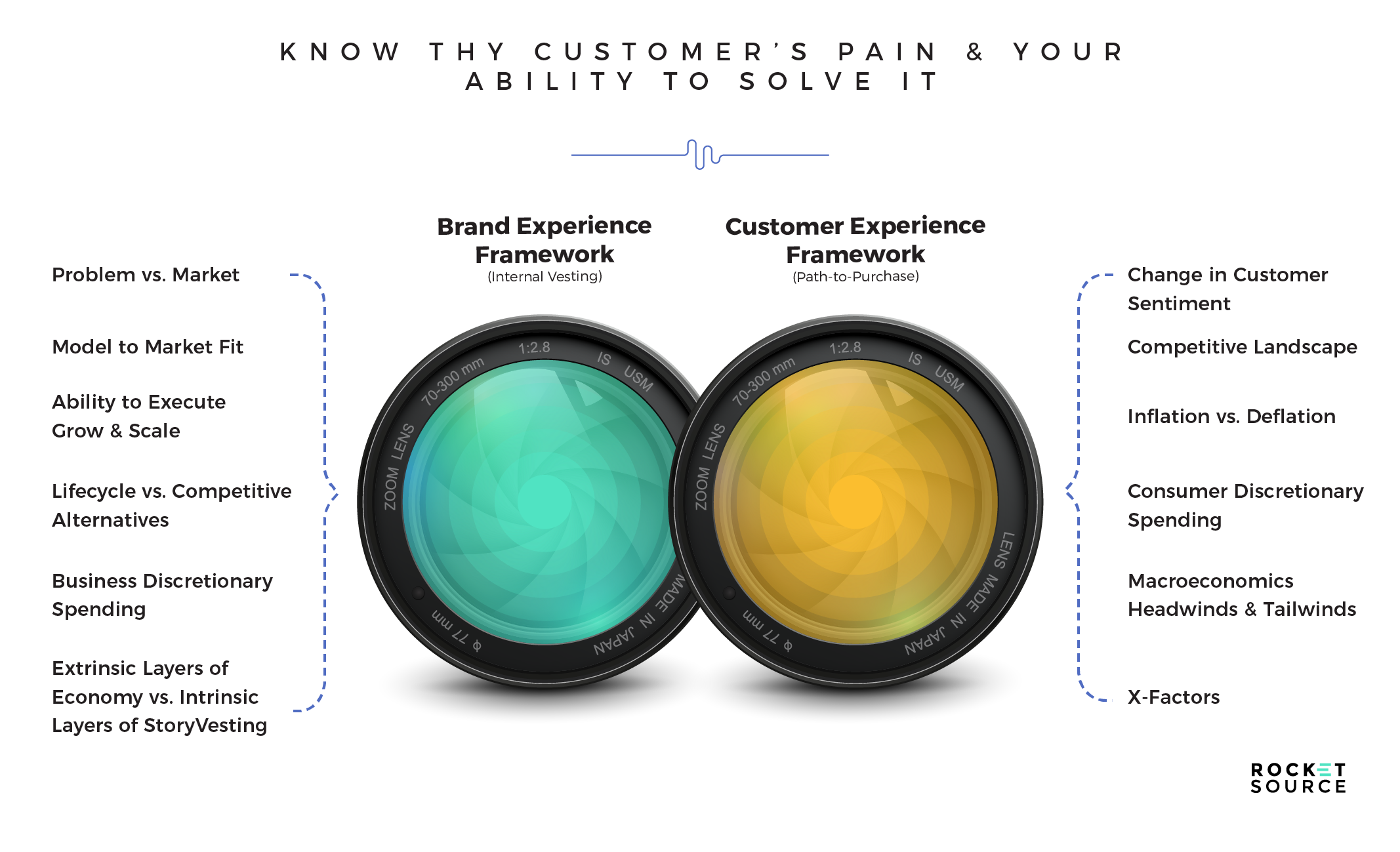
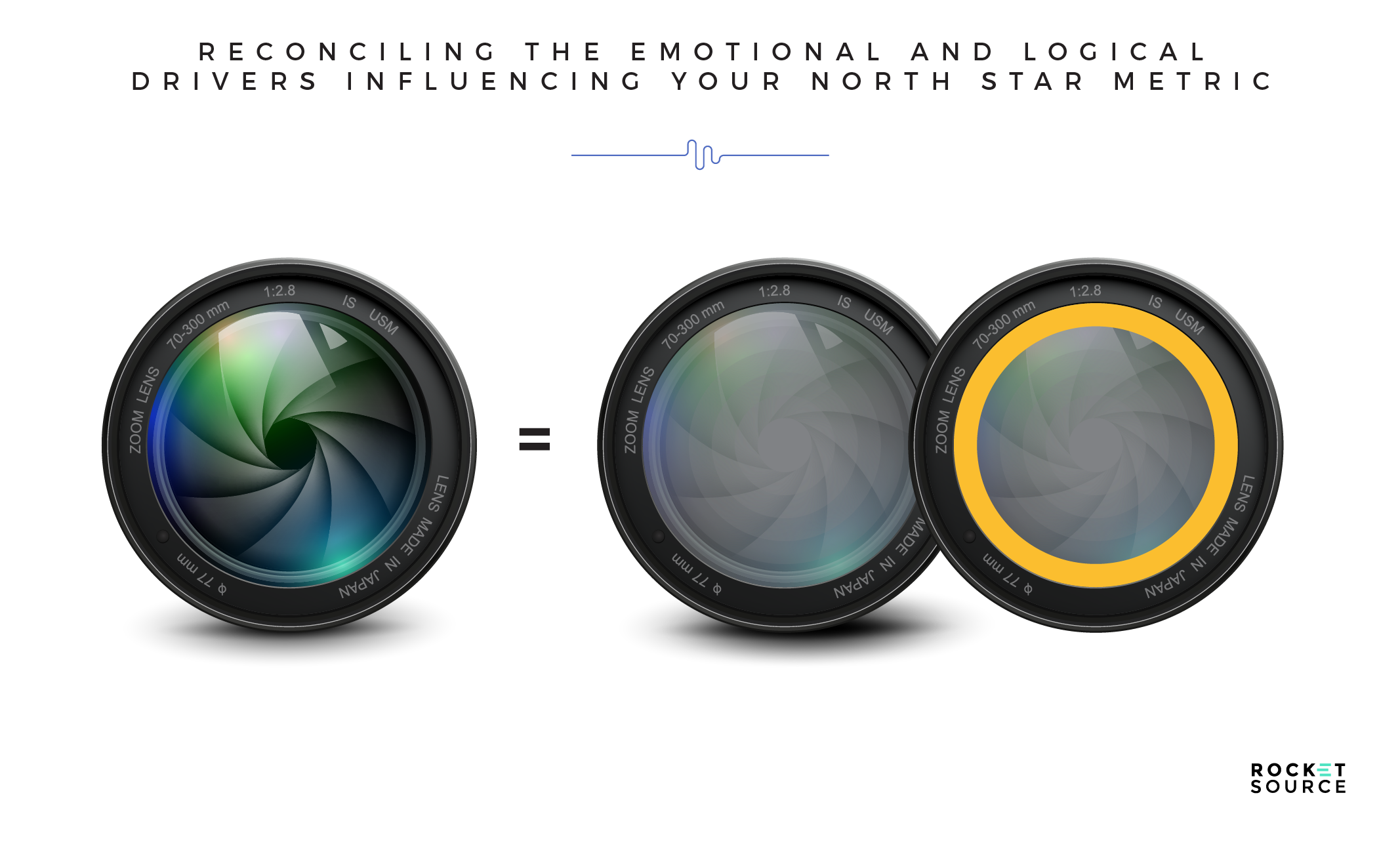
I love this imagery in the StoryVesting framework because it showcases how we’re seeing the world through two distinct, yet similar, lenses — the Employee Experience (EX) in blue and the Customer Experience (CX) in orange. StoryVesting then fuses those two perspectives together to identify pain points and solutions.
In taking a radically empathetic approach to understanding your customer, your employees, and your business as a whole, you’re able to leverage the same kind of behavioral data Facebook has to get that predictable fuel that will spur your growth. Let’s dive in a little deeper, because the power behind this model is in the nuanced details.
Understanding Your Customer Through StoryVesting
Before you can identify a solution to a problem and a North Star Metric to monitor your progression towards that solution, you must understand your customer’s perspective. This starts by looking at the center of the circle and moving outward.
Changes in Customer Sentiment
In the center of the customer experience lens, we like to look specifically at customer sentiment. Changes in customer sentiment affect the why of a customer’s core emotional triggers. Those triggers are the ones that drive a person to peer deeper into solving a specific problem — one that your business can solve.
Understanding customer sentiment in today’s market is critical. It shapes how you pitch your services. It empowers your messaging to reinforce the why, so you can tug on heartstrings first, followed by purse strings. Everything starts here with customer sentiment data, so it’s critical to have your finger on the pulse on this metric.
Competitive Landscape
Immediately after a customer is triggered emotionally to dig in deeper to solve a problem, they start looking at the market. They go to Google. They talk to friends. They’re moving from an emotional stance into a logical stance to try to uncover what options are available to them.
It’s at this stage that they’re put nose-to-nose with your competitors. Not knowing the competitive landscape will affect your ability to compete for a value proposition that will reconcile your customers’ wants and needs.
Inflation vs. Deflation
Zooming out further, the customer starts to logically decide if they can afford what you have to offer. In this stage, your business must know if you’re in a macro trend of inflation or deflation.
The current and upcoming economic background will affect so much of what your business offers and how it’s presented to your customers. For example, the economy impacts your Cost of Goods Sold (COGS). It impacts your general and administrative expenses. It also impacts how your 3 Ps — people, processes, and platforms — are aligned.
The bottom line is this — if you’re trying to build a business model in an inflationary environment (like the one we’re in right now) and don’t understand the impact this has on the concentric circle in the customer’s journey, then you have a mismatch. You must understand how the consumer’s job, money, passion, and purpose lead to their decision-making around purchases in your niche. If you don’t, then you won’t know how to sell your products against the macro headwind and tailwind of an inflationary time period.
Consumer Discretionary Spending
Just as you must analyze the macroeconomics of today’s backdrop, you must also look carefully at your customers’ discretionary spending. How much extra cash does your target market have on hand to spend on your products or services?
Finding this data isn’t as easy as a quick Google search. You’ll need to talk to your customers about specifics. For example, if you’re selling an online university program you’d want to get on the phone with some people in the procurement department of the businesses you’re trying to work with. If they tell you that their budget for individual training has gone from $500 to $2,000, then you’ll have a solid figure and understanding to use to price out your product.
This metric is all about how your consumers are allocating spend. It is directly proportional to the elasticity of demand, or how much you can charge a customer. And guess what? Your customers are constantly understanding their own spending through this same lens. Whether we realize it or not, we’re constantly analyzing our take-home money and how much we can spend to make sure that these things align. By bringing it to the forefront, you can better predict consumer behavior and discretionary spending.
Macro Headwinds and Tailwinds
Macro headwinds and tailwinds signal what’s happening in the market. They showcase where the economy is going, which is a strong indicator of how your customer is feeling in terms of spending. Having a steady finger in their air to sense which direction the winds are heading will help you understand demand.
In StoryVesting, we use macro headwinds and tailwinds to understand how the economic backdrop will affect your competitive positioning and offering in the channels where your cohort resides. Without knowing what’s happening in the market as a whole, it will be increasingly difficult to understand the right strategy to reach your customer, let alone predict future behaviors.
Experience
Customer Experience isn’t defined by one single interaction with a brand. It’s the sum of many interactions, behaviors, and decision-making elements.
When each of the above layers are stacked upon each other, you’re left with the zoomed out view of an overarching experience. At this layer of StoryVesting we analyze the X factors. Design, content, and all of those micro ah-ha moments are what make up the overall experience of a brand.
To paint a picture of what a StoryVested customer experience looks like in real life, consider the ride-sharing company, Lyft. When the pandemic hit, Lyft knew that many single people were left dateless or to were forced to date via Zoom. Now that society is returning to a near-normal state, Lyft has decided to help one of its core groups of customers get back into the dating scene. To do that, they’ve partnered with Tinder, a dating app, to help their riders get back to in-person dating.
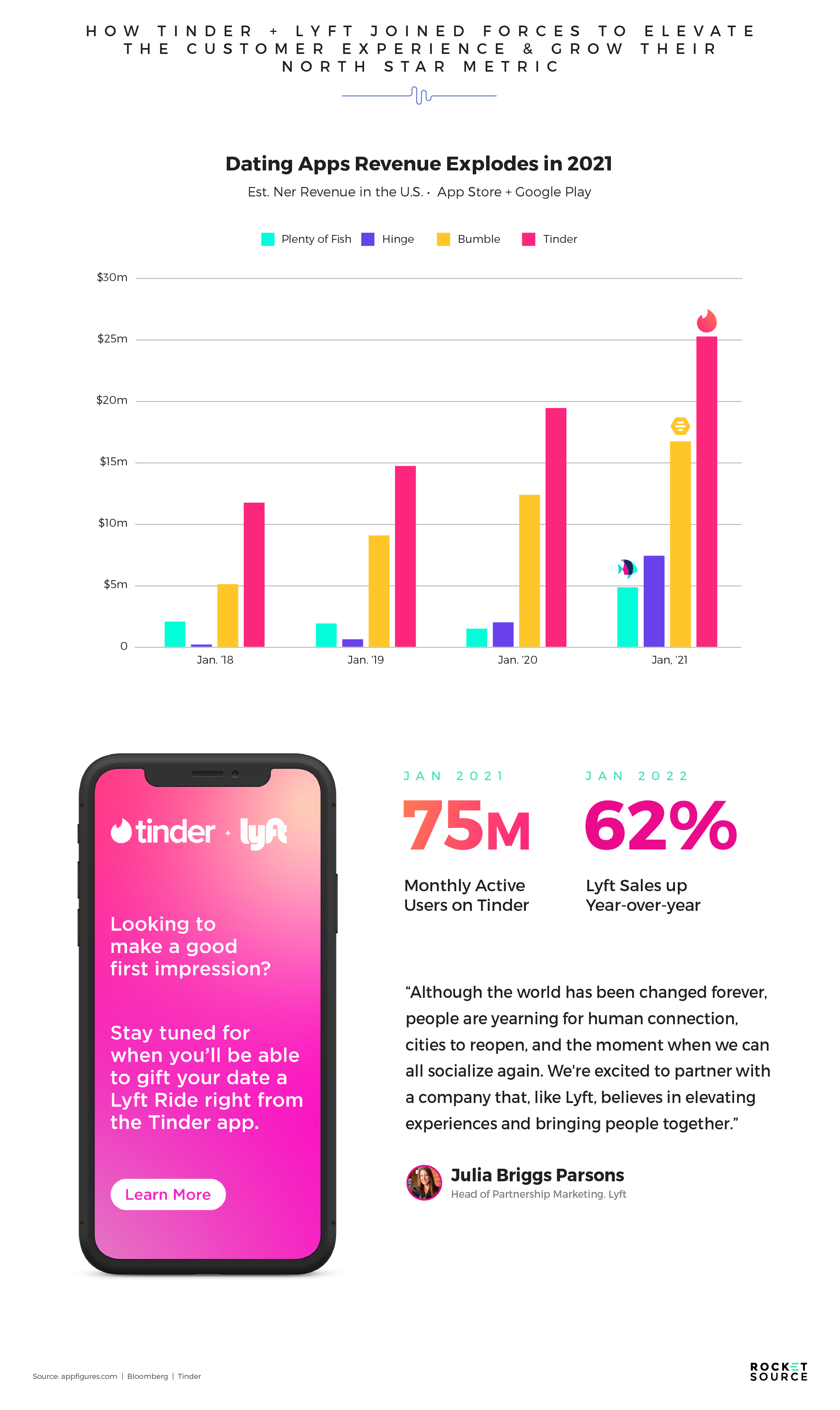
In January 2021, swipe activity hit 3.4 billion on the dating app Tinder. By February 2021, Tinder noticed a large uptick in the phrase “go on a date” on user profiles. That phrase, paired with the macroeconomic tailwinds of vaccine availability and reduced lockdown statuses, signaled to the dating app that their users were starting to feel ready to have face-to-face dates again.
Enter Lyft. The ride-sharing app knew that there was a huge potential for increasing ridership again for their customers by stepping up their experiential game to meet these excited daters again. Lyft coupled with Tinder to help get daters back out there, and by October 2021 had rolled out new features. Daters didn’t have to ride in the same vehicle in order to meet up. Instead, daters could “Create a Ride Credit” to gift their dates a Lyft ride directly from the app.
This partnership made sense across all layers of StoryVesting. Both brands understood customer sentiment was low and daters wanted to get back out there and find a match. Both brands understood the competitive landscape and wanted to draw in daters and riders to their apps. They noticed the economic trends steer in their favor as jobs and peoples’ passion for pursuing matches both began to return. Consumer discretionary spending was such that they knew daters had the income to eat out and pay for their dates to get to and from the restaurant safely. The macro tailwinds with the vaccine rollouts meant that more daters felt comfortable getting back outside. Overall, the combined brand functionalities left their daters with a seamless experience that honored their emotional and logical needs.
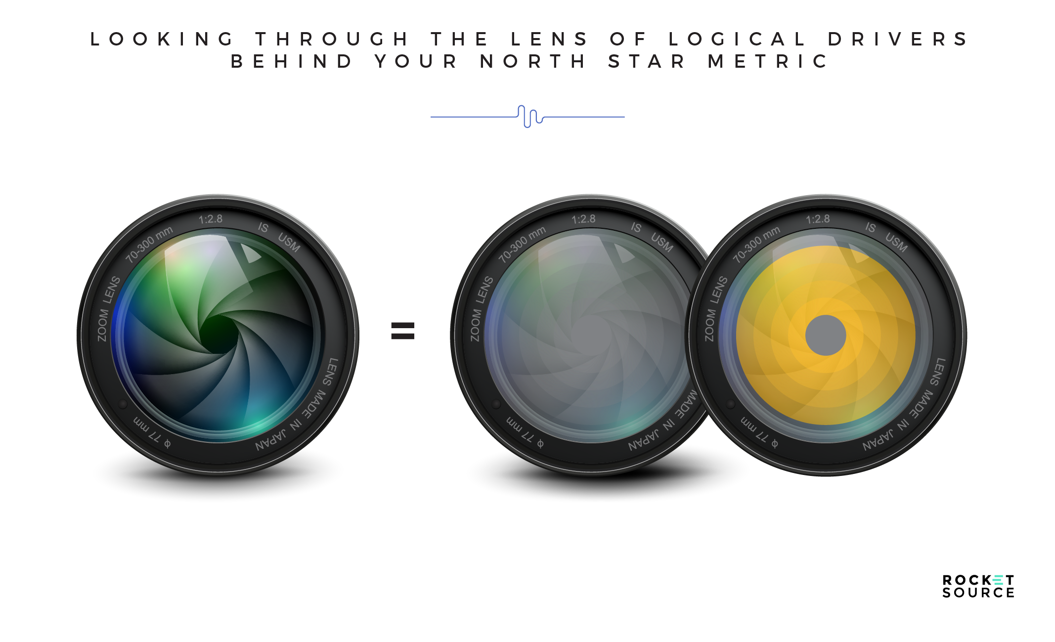
Understanding Your Organization Through a StoryVested Lens
Customer experiences don’t happen without a strong team building them out behind-the-scenes. It takes multiple layers and nuances internally to roll out a beautiful experience externally. To hold a predictive stance and understand your market’s demands, you must look closely at what’s happening internally, too.
Problem vs. Market
Before you can do anything in your business, you must look at the size of your market. Is it viable? Is there a market there that will want to consume what you have to offer? In the Lyft and Tinder matchup I talked about above, the apps probably only tested the new features in markets where it made sense, such as cities with dense populations. Rural communities probably don’t leverage ride-sharing in the same way.
As you’re building an assumptive model, you need to do a total addressable market analysis, or a bottoms-up analysis, to understand your market.
- Is what you’re producing a need or a want for your company?
- Is the leadership determined to solve the problem you’re trying to solve?
- How committed are your teams’ members and leaders to getting this right?
There’s a trickle-down effect that goes through the entire company. If your leadership doesn’t see the problem vs. the market in the same way your teams do, they probably won’t pursue the solution as valiantly or from as determined a standpoint.
Model vs. Market Fit (vs. Competition)
As you solidify that you have a problem that needs solving, it’s time to align that problem with your business model. To do that, you need to analyze the market versus the model you want to pursue. Is there enough market share to make the model viable? How big is that problem you’re trying to solve?
You should be able to rattle off the answers to those questions quickly because the need should be crystal clear. Understanding how much of the market is ripe for capturing, and the residual effects, will help determine your business model and how much you’ll be able to capture over the next one, five, or ten years.
The 3 Ps
In StoryVesting, the 3 Ps are your people, platforms, and processes. Each of these elements is an essential building block for a successful business.
Your ability to execute, grow, and scale is dependent upon how good you are at hiring. Looking at your team, are you confident that they are vested in your organization’s why? Or are you hiring people who simply want a job? There’s a tremendous difference between the two and between the outcomes you’ll get as you grow and scale.
Likewise, you need the right processes and platforms in place to bring ideas to life. Not only do you want your internal processes to be smooth, but you also need bulletproof processes in place for connecting with customers in the right place and at the right time.
Lifecycle vs. Competitive Alternatives
As you start to move from idea mode and into development mode, you’ll need to analyze your market even more closely. More specifically, looking at the lifecycle of your products will enable you to understand how well you’ll be able to gain traction, grow, and scale over time.
Competition should be accounted for here as well. If there are close competitors that your market will turn to over time, it’s important to analyze what those competitors are doing differently and how they’re meeting a deeper market need that will slowly siphon your market share.
Business Discretionary Spending
Growth doesn’t come without investment. Putting ideas into motion requires your organization to allocate capital. Your business’s discretionary spending will determine how much you’re able to allocate.
This discretionary spending isn’t only about how much you have to spend. It’s also determined by where you spend your money. For example, if you know you need to do a paid media strategy or a demand generation campaign but you don’t have any money to invest in those areas, you’re doomed. You won’t be able to scale, no matter how good your product might be.
Extrinsic Layers of Economy vs. Intrinsic Layers of StoryVesting
All of these layers come together under one umbrella. The ripple effect of the employee’s experience and the brand experience ultimately drive the overall performance of your team.
A great example of a company that’s leveraging a strong employee and brand experience to grow is Ritz-Carlton. This brand is well known for its customer experience, but that experience is driven internally by the people across all layers of the organization.
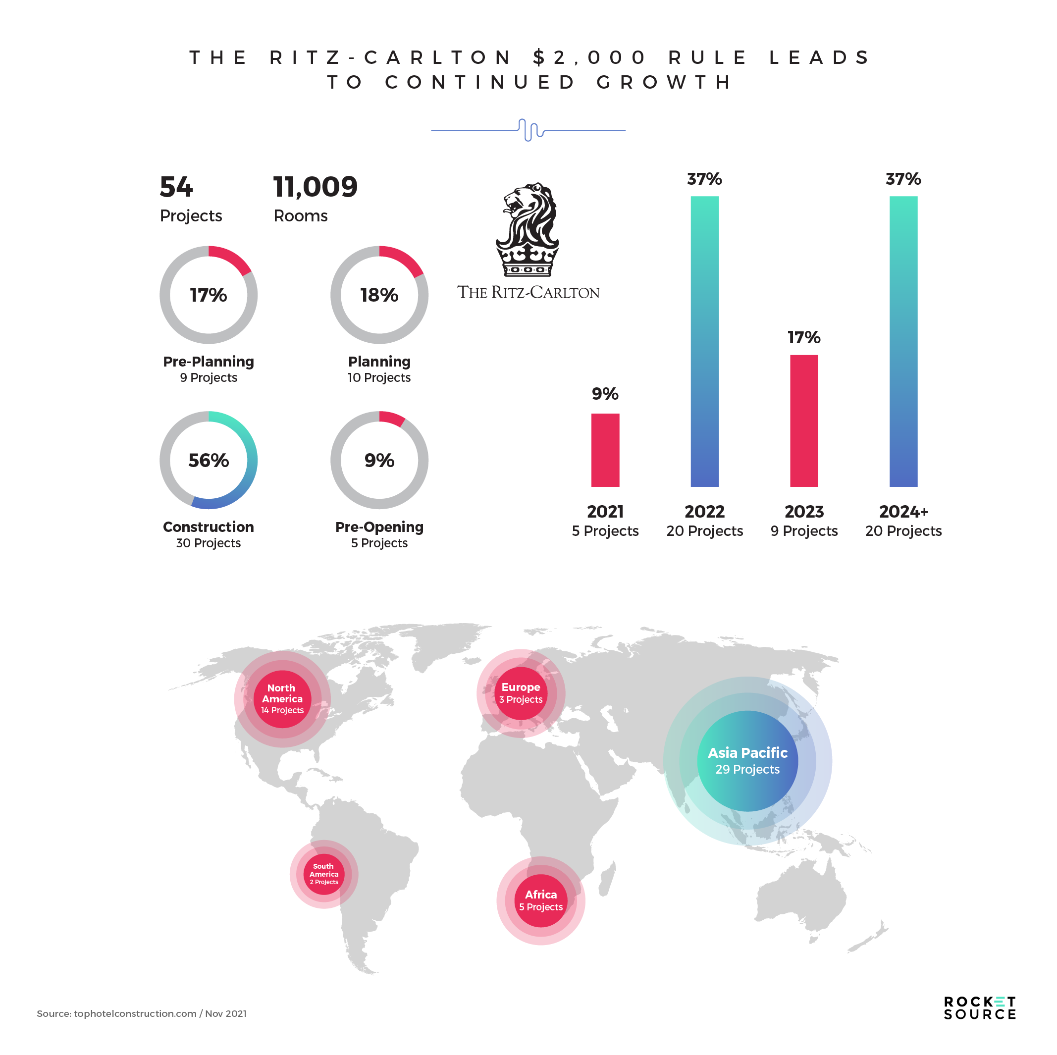
Ritz-Carlton knows it’s frustrating for customers to be passed around between managers in a confusing organizational structure. Even more so, it’s frustrating for employees at all levels to be met with irate guests. To solve this problem, the hotel chain knew it had to give its team some leverage to solve guest concerns quickly and efficiently, so it granted each employee a discretionary spending account of $2,000 to deal with any obstacles in the guest’s experience.
In offering this type of discretionary spending and allocating it to the end experience, employees — the people of the business — are able to streamline their processes and offer a more personalized service. Remember how I said earlier that hiring the right people matters? This type of brand experience is where it plays out. Ritz-Carlton doesn’t have a North Star Metric rooted in occupancy of their rooms. Instead it digs deeper, looking at customer satisfaction and lifetime value to understand whether their guests are returning time and again to their rooms. The services rendered by those people are more likely to keep customers from wanting to go to another competitor for their next stay, while also allowing the employees to feel trusted and like a critical part of the business.
Finding Your North Star Metric Via the Bow Tie Funnel
Now that you have a better understanding of how we look at business growth through a StoryVested lens, let’s go back to the question of where to start when it comes to determining your North Star Metric. To me, the answer is clear — the bow tie funnel.
I firmly believe that for anyone, from analysts to growth engineers and growth marketers, starting with the bow tie funnel will put you in the top 10%. That’s because, while most North Star Metrics focus on what drives predictable growth, with the bow tie funnel we’re more focused on something far richer: retention.
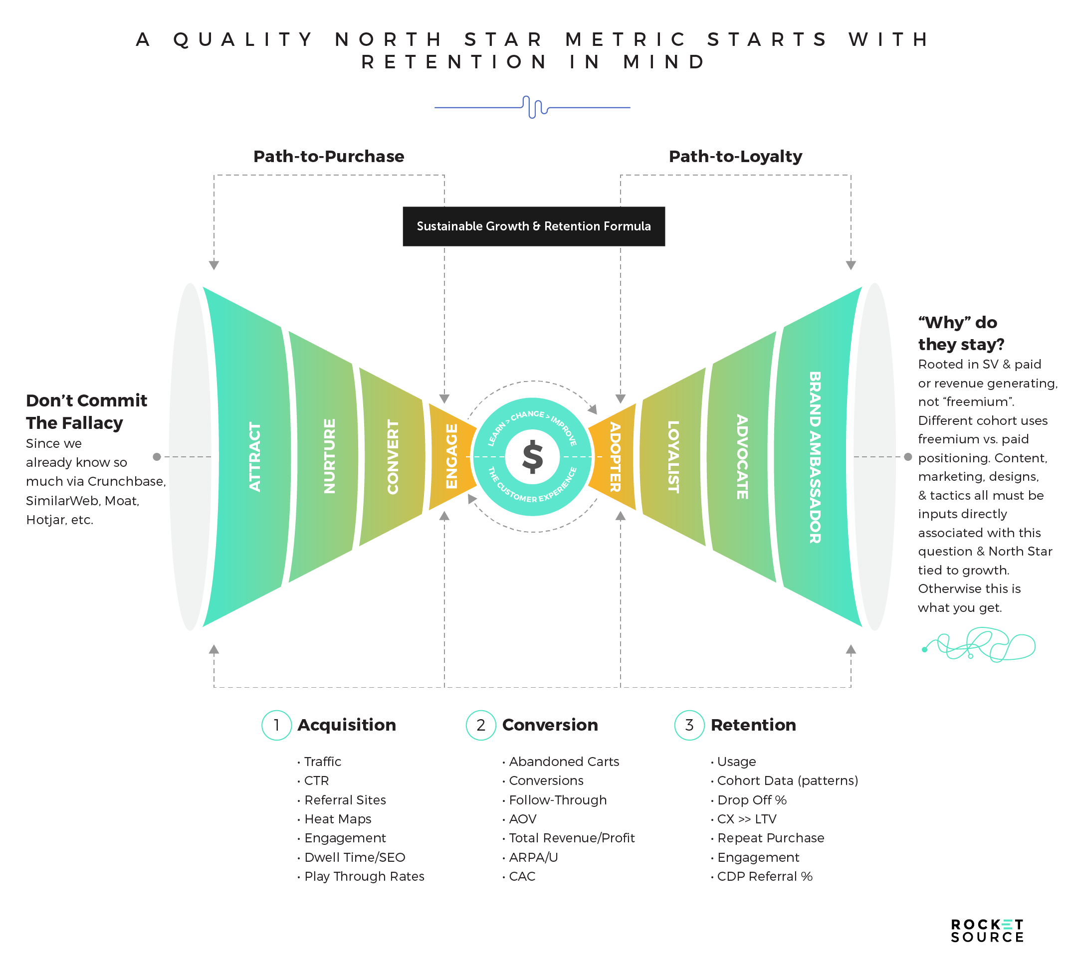
If you’ve read my posts on the Bow Tie Funnel before, you’re familiar with this image and its nuances. For the sake of this post on North Star Metrics, I want to draw your attention to two areas: the closed dot at the front of the funnel and the open dot at the back of the funnel.
The Closed Dot at the Front of the Funnel
At the front of the Bow Tie Funnel, I’ve put a closed dot. I’d wager a guess that around 90% of businesses focus on this part of the funnel first.
This dot is closed because there’s not a ton of new information needed at this stage. The reality is that we already know our customers well. We have the behavioral data at our disposal to know what they’re doing, where they’re going, how they arrived, and where they churn. All of this behavioral data is vanity data. It doesn’t actually matter nearly as much as we give it credit for. By relying on the top of the funnel, at the start of the funnel data, you’ll end up going aimlessly into your metrics and your decision-making because you’re focused on the wrong stage.
Starting from this stage often happens because we believe the fallacy that we don’t know anything up top. If it were true that we didn’t know anything about what was happening during this part of the journey, starting here would make sense, but it’s just not the case. Look at all of the places where you can go to find more information about your business model. SimilarWeb. CrunchBase. Moat. Google Analytics. Heat Mapping. There are so many resources out there that shine a light on what’s happening in this stage.
The Open Dot at the Back of the Funnel
If you’re making decisions rooted in the StoryVesting framework outlined above, then you must start at the back of the funnel. I put the open dot in this part of the funnel because it’s the area most open for questioning. When you start at the end of the funnel and ask, “why do my customers stay?”, then you have a lot of experimentation at your disposal to get that answer.
Full disclosure: Answering this question is hard. Really hard. But it’s these hard whys that are damn hard to solve but so, so worth it.
Analyzing this why requires that you take each cohort into consideration. For example, if you have a free service versus a paid service, you’ll have two totally different cohorts. The paid cohort might not use the service on a free site. The free users might not ever want to pay for that service. They’re just two different cohorts with different needs, so as you’re deciding why someone stays and how to move from a free to a paid model or vice versa, everything changes. Knowing how to ask the right questions and look at the right metrics at each stage is crucial so you can know which metrics will matter most to your business.
Metrics at Each Stage of the Bow Tie Funnel
I’ve been lucky enough to be part of at least a dozen growth builds that have led from millions to multi-millions in a short amount of time. I don’t say that to brag, but rather to paint a picture. When I started putting this post together, I got to thinking about how many times I started by using top-of-funnel metrics to build an assumptive model. You can probably guess, based on my comments above, that I’ve never, ever used top of funnel metrics to build a predictable assumptive model since everything I do is rooted in questions around LTV. If I don’t start with LTV, it will throw off every assumption I have about growth. That’s why I often refer to the Bow Tie Funnel as the Bow Tie Why since it’s a standalone framework I created to sync with StoryVesting. Remember that StoryVesting is all about discovering and aligning both EX and CX across the idea of “Why They Stay.”
Still, while modeling or writing algorithmic scripts for any kind of analysis, I believe top-of-funnel metrics have a varying degree of value. When building the North Star metric assumptive model, you start at the end of the funnel and make decisions in conjunction with top of funnel analytics. That’s why knowing when to apply those forecasts at specific stages is so important. Take a look.
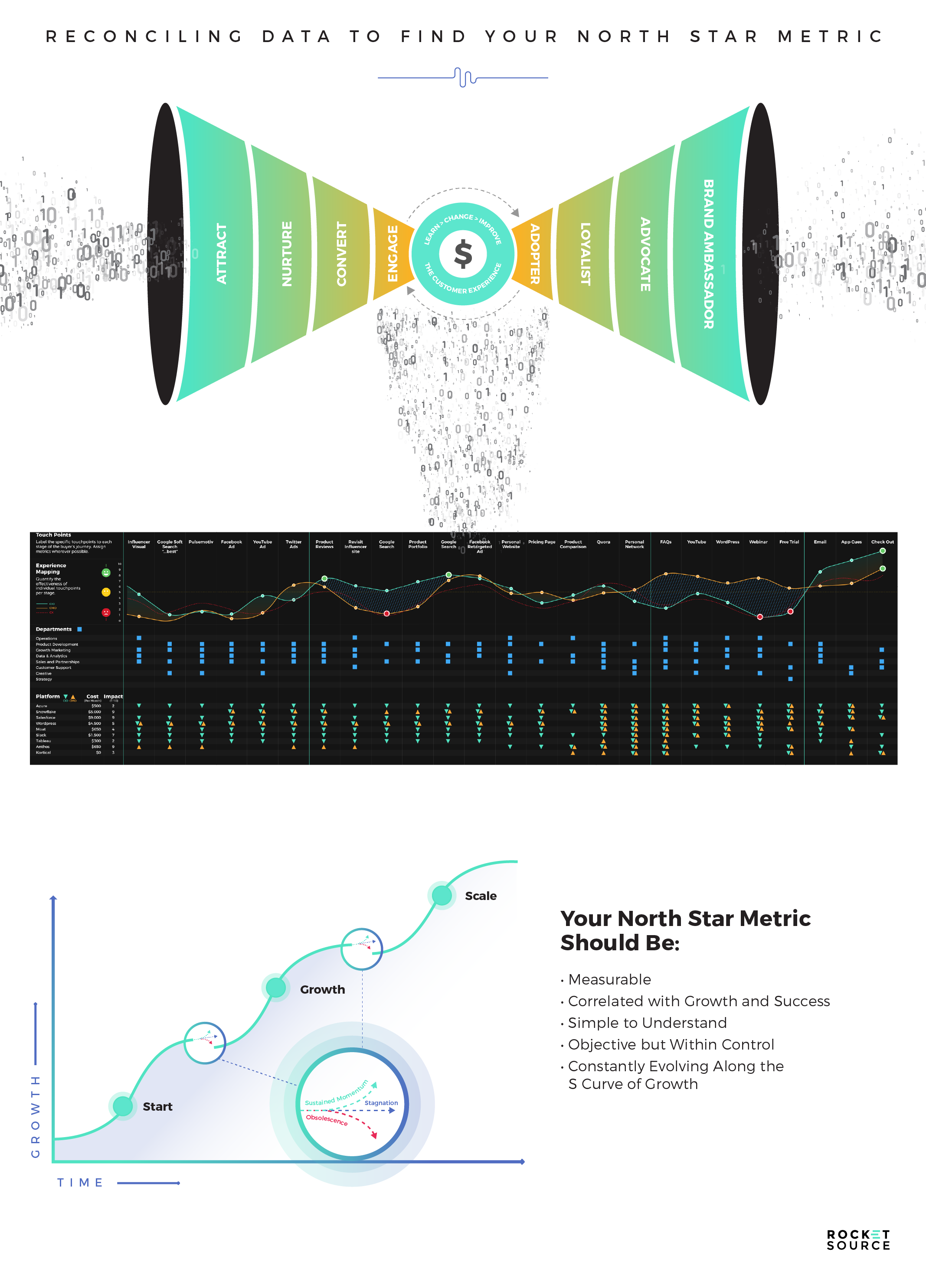
We always start with the retention metrics, such as Cost of Acquisition to Lifetime Value ratios (CAC:LTV) or repeat purchases and engagement because those metrics are what will drive a growth model home. These metrics are rooted in why a customer stays and how long they stay. They showcase motivational triggers, which inform how funnels, landing pages, and product iterations get built. These motivators and behaviors will spur the longevity of a company and keep brands relevant, no matter the economic backdrop.
That question of why they stay is the ultimate question for accuracy when deciding on growth initiatives. The answers can range from ease-of-use and convenience to the talent of the team or social credibility. No matter what the answer is, knowing that why and those motivational triggers will lead you to the value proposition.
The reason a customer will stay with your brand comes as the perceived value exchange. What they get in exchange for paying for your product is ultimately at the heart of your business model. The alignment between the Brand Experience and the value you deliver, and the Customer’s motivational triggers for staying is critical. It’s that alignment that determines your long-term success and is what will help flesh out your North Star Metric.
Assessing Alignment as a Means of Finding Your North Star Metric
Over the years, I’ve developed and taught several bolt-on exercises and frameworks to sync with the StoryVesting framework to help determine this value proposition.
One of these exercises is a unique, modified Hoshin exercise, which I talked about in my post about customer journey mapping. It allows you to silently ideate on business process optimization — essentially the core baton handoffs from department to department where the process is tantamount to establishing a successful companywide North Star Metric or completely failing at it.
This exercise is used by companies around the world to improve upon processes. Part of improving processes could mean discovering, uncovering, and improving upon something like how data flows into each organizational unit. From there we could back that data flow — whether it’s behavioral data, second-party data, etc., into some more specific that is attributable to growth. From silencing the loudest voices in the room (since the exercise is done in silence) to quickly highlighting the driving inputs and outputs of each process, the Hoshin exercise is a powerful framework used by the likes of Toyota, Nissan, Nestle, and others.
We will then often pair the data found during that exercise with other data we’ve found through our research to develop gap data visualizations — like radar graphs or the Barlow Bands — to pinpoint the most important factors in the employee and customer experience. These radar graphs and Convergence/Divergence visualizations let us empathize with both the customer and the employee through the lens of the StoryVesting framework. We’re able to democratize the data we’ve found to get a deeper connection and understanding of what’s happening across both journeys. We’re able to map this data to each cohort and use it to quickly visualize where we need to focus our attention, where we’re missing the mark, and what we can do to improve our overall experience. In most client engagements, this work is all done behind the scenes, which makes our offering somewhat unique as we talk the talk and walk the walk of eating data to foster growth, build moats, and keep our clients more relevant than their counterparts.
There are dozens of others, but the point is this — every framework, every exercise is done to help us know how and where to align novel concepts, ideas, and vision with the current market momentum and market share potentiality.
Assessing alignment isn’t easy. It requires asking the right questions at the right time to get to the core why across both customer experience and brand experience. That’s because every business situation needs to be handled differently based on circumstantial drivers. For example, a lack of retention could be fueled by a lack of employee vestment or poor company culture. It could also be fueled by poor CX or LTV drivers. Understanding what’s out of alignment will help you better assess what needs to shift in your business and which metrics you need to focus on in order to drive those shifts and monitor their success.
One way to think about how to implement this is to look at the StoryVesting circles in 3D, like that of a buckyball (psst…for all those scientists out there, please just squint here). Before I go any further, let’s just think about dimensions and perspectives for a second. In every single Customer Data Platform (CDP), marketers are trying to extract as much perspective as they can about the data from their cohorts, their personas. This mental and spatial visualization process is no different except that it does take some practice to manually visualize and extract any meaningful insights from that flow. Remember, at THIS STAGE of humanity and tech innovation, software, hashing, and machine learning will only go so far. Obviously, I’m not espousing going back to the Stone Age; we leverage software like Segment, Telium, Snowflake, AWS, MongoDB and other powerhouse software systems that can do much of the heavy lifting.
From single dimensions to 3D (or even 4D if we slice it along the planes), it’s important to use these visuals in a way that your team best processes data. I like using the simple analogies of flat concentric circles, horizontal planes, and three-dimensional mental structures like a “buckyball” for visually aligning behavioral data sets.
As you saw above, in StoryVesting we use the teal color to signal the Employee/Brand Experience (EX) side and orange to signal the Customer Experience (CX) side. Here, we’re differentiating two sets of circles using those same colors to help separate the two sets of data. However, our goal is to move these out of No Man’s Land and into alignment by bringing them as close together as possible. It’s only when more gaps are filled and more sets of data are aligned that you can grow revenue.
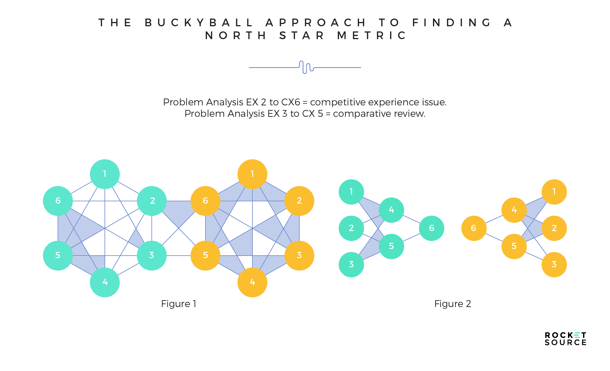
In Figure 1, if you’re solving for and/or running a BX, EX, or CX-driven growth initiative you’d start architecting your data looping structure and data flows by aligning EX concentric circle 6 (Employee Experience) to CX concentric circle 6 (Customer Experience). StoryVesting serves as the prioritization and problem-solving framework on Day 1. From there, you’d work it backward to find your gaps (highlighted in blue) between each concentric layer of StoryVesting across the customer journey. Subsidiary frameworks like Hoshin, Radar Mapping, CIM Mapping, BowTie Why, and many more are all used to flesh out those misaligned ripple effects for each concentric circle of StoryVesting.
In another data looping architecture, Figure 2, which is much more common, we start by determining where the major convergent/divergent gaps exist and align those gaps first in order to gain quick wins. Time and timing are everything in business and we don’t dilly dally at RocketSource.
Here’s an example of how it could work in Figure 2. Let’s say that circle EX 2 signals a degradation of a specific element in a business model and CX 6 signals a customer experience issue that just might be flashing huge red alerts. This gap between EX2 and CX6 could signify one of two very stark things: 1) your competitive positioning is losing ground based on intrinsic factors rather than market/competitive factors, or 2) your front-facing customer experiences are no longer aligned with your current business model or value proposition as compared to your counterparts (or alternatives). Obviously, much more concrete data is needed to make specific changes, but you get the point of how clear StoryVesting can be for solving major friction points while unlocking key elements to driving growth through those essential inputs for a North Star Metric.
Mapping EX and CX together empowers you to quickly identify gaps in your business’s growth framework.
By identifying what’s happening internally and externally, you’ll be able to quickly see what you need to solve for in order to push upwards on the S Curve of Business and then correlate those inputs against your North Star Goal.
As you start to pair these various circles and identify gaps, you’ll be better equipped to make future decisions for your business. If an employee comes to the leadership team with an idea for a CX initiative, your entire team will be able to look at the initiative and determine if there’s alignment and then be able to measure its progress against your metrics. That’s why internal alignment and communication are key, and why North Star Metrics can be so powerful and a guiding force for any complicated initiative. Every leader speaks the same language. Departments start working better together.
On the surface, that buckyball-type approach to assessing alignment might seem straightforward. The hard part isn’t mapping the two areas together. It’s gathering the data, finding patterns in that data, and solving for the persnickety details that drive sustainable growth on metrics that truly matter at the BX core (alignment of EX + CX). Only true CX-driven companies have active and progressive voice of the customer (VoC) data, and true EX-driven companies set voice of the employee (VoE) initiatives in motion at least quarterly. From the various data sets you’ve collected, you work it backward to get to the aligned why and solve for problems stunting any upward growth. This is a highly effective way to leverage the StoryVesting and subsidiary frameworks for growth and solving for your North Star Metric.
Wielding StoryVesting Effectively to Find Your North Star Metric
The challenge with StoryVesting is that there’s no cut-and-dried answer that spans across multiple companies. The findings and data are different for every single company. Every situation is unique. Every challenge has its own solution. There’s not a one-size-fits-all approach. Yet, when wielded properly the framework can drive accurate, predictable, and repeatable outcomes. That’s because both inputs and outputs are measurable. Having the right North Star Metric in place ensures that we’re staying focused on the right areas.
Still, there are so many metrics you could monitor:
- Win vs. loss percentages
- Total revenue
- Total revenue growth
- Total profit
- NPS
- CSAT
- CES
The list can go on and on — and it gets even longer as you start to add complexity to your business models:
- Product/market fit
- Design to development cycle percentages
- Cohort analytics for measuring traction
- Total costs per employee
- User growth
- Word of mouth
It’s not easy to figure out what to measure. It takes work, testing and refining to reconcile the complexities of the data against the entire business experience (BX) of your company’s and the customer’s journey.
When it comes to your North Star Metric, that reconciliation is key. The North Star Metric is aligned with your company’s Brand Experience strategy. That strategy makes up all of the Employee Experience elements, too. They have to be aligned.
On the Customer Experience side, the North Star Metric is aligned with that ah-ha moment of value. That’s the lightning in a bottle moment when the customer knows exactly why they’re using your paid products. I emphasize the word paid because business doesn’t grow on offering free products alone. There needs to be an ah-ha moment behind why a customer will want to pay you for the value you deliver.
The North Star Metric must be continuously aligned with your Bow Tie Funnel’s open circle that states why someone stays with your business. It must be measurable, highly correlated with growth and success, simple to understand, objective but within your control, and constantly evolving at your company’s S Curve inflection points.
Feeling overwhelmed? I don’t blame you. Here’s the kicker as to why it’s so hard to ascertain and quantify — it’s freaking hard.
North Star Metrics require a lot of testing, thinking, analyzing, synthesizing, problem-solving, and patience to get right. Without a determined daily and weekly commitment and patience to its correlated discovery, you will derail sustainable growth efforts, and will instead go around in circles like this.

You’ll continue on a hamster wheel while playing the guessing game. In reality, what you need is to accelerate your revenue, and your North Star Metric will get you operating more intelligently and maturely.
Ready to talk this through with someone on our team? We’re here for you. Schedule your complementary North Star Metric consultation and we’ll be happy to help tame the feeling of overwhelm with specific and direct guidance for your organization.
Schedule Your Complementary North Star Metric Consultation
Revenue Acceleration via a North Star Metric
Many companies live in legacy-style thinking. They’re conversion-focused, looking exclusively at metrics like Cost Per Lead (CPL), Cost of Acquisition (CAC), and Return on Investment (ROI). While there’s room for that type of analysis and those metrics certainly have their spot in revenue acceleration, we like to look more closely at intelligent operations instead. Here’s the difference between the two:
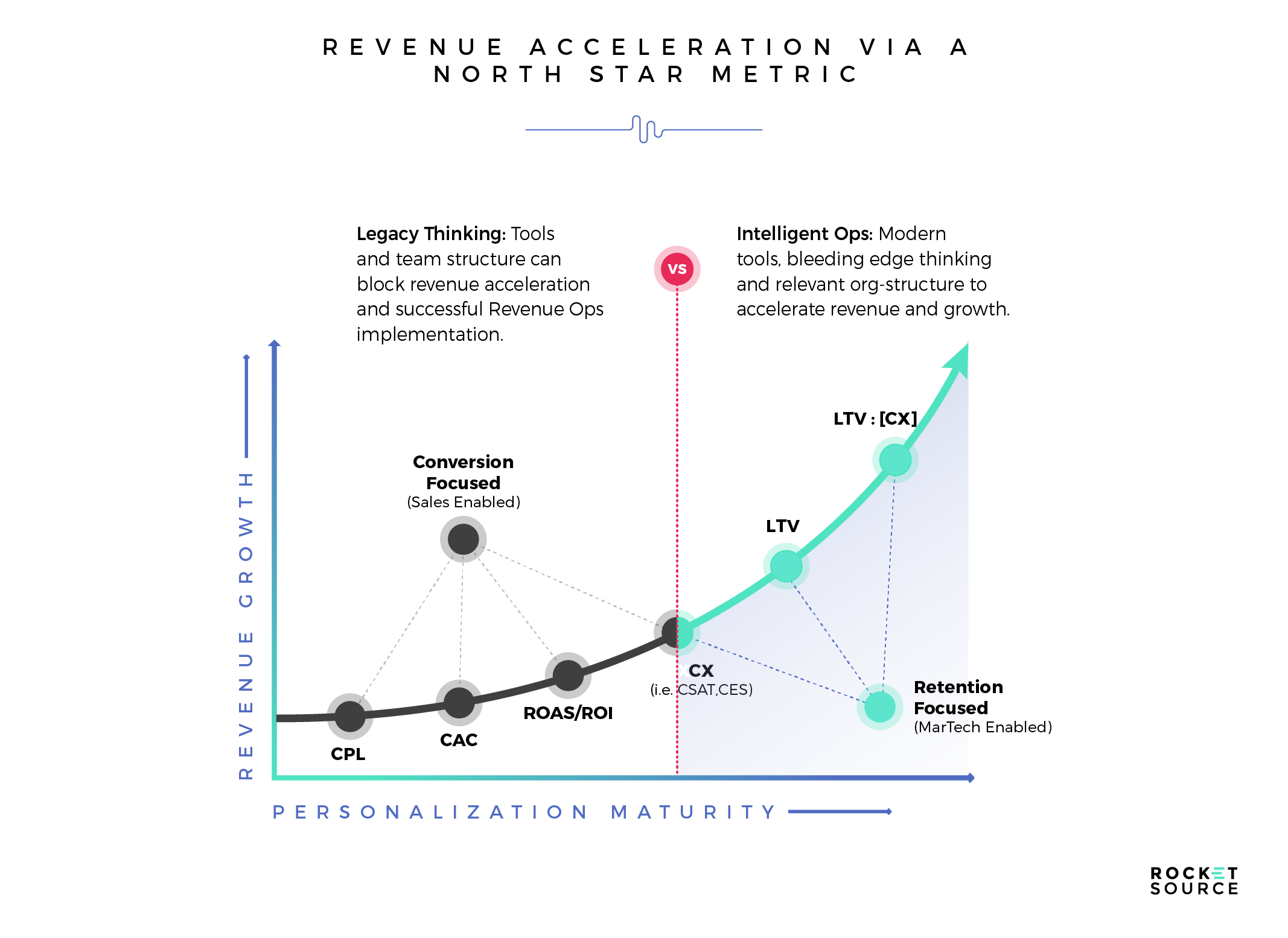
The blue area here is the retention side of the curve. This is where you’ll see the biggest growth and lift. And notice what you won’t see on this graphic at all — the top of the funnel. We never, ever focus on things like site visits or social media account followers to drive growth. We’ve always focused on the end of the funnel in a behavioral-driven, lifetime value (LTV) lens which highlights those critical “why they stay” moments.
You can Google this data and you’ll find a slew of answers — so many that it’ll probably overwhelm you. At RocketSource, we’re masters of simplifying the complex. There are certain things that we use time and again to measure simple, yet powerfully insightful data over the long run.
As you’re starting to hone in on which North Star Metric to use to track your organization’s growth as you begin new retention initiatives, here are just some of the powerful metrics you could look at to determine which growth levers to push and pull.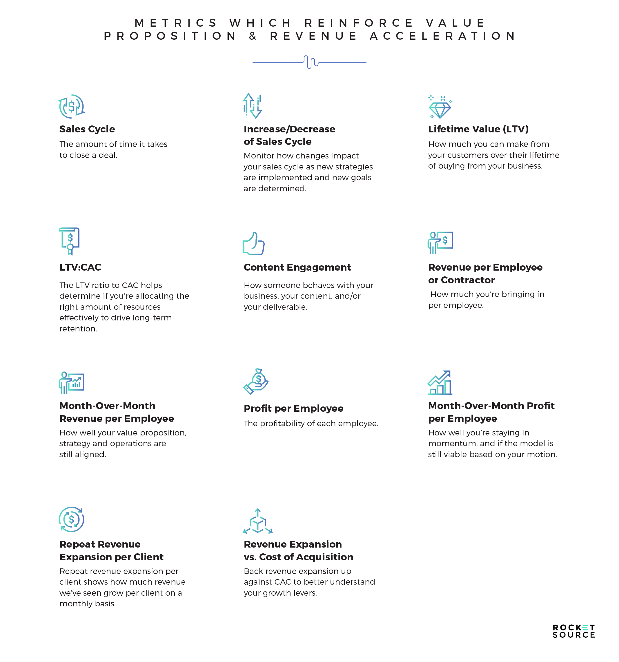
Sales Cycle: The sales cycle looks at the time it takes to close a deal. Long sales cycles are problematic, as you can imagine. By honing in on your value proposition, you can reduce your sales cycle. Still, we want to continue innovating, so we’re continuing to look for innovative ways to further reduce our sales cycles.
Increase/Reduction in Sales Cycle: Over time, as new strategies are implemented and new goals are determined, it’s a good idea to monitor how those changes impact your sales cycle.
Lifetime Value (LTV): By understanding how much you can make from your customers over their lifetime, you can better determine the strength of your value proposition. For example, if your customers are trying to decide whether they should work with you or keep the work internally, they’re looking at your value proposition.
LTV:CAC: The LTV to CAC ratio helps determine if you’re allocating the right amount of resources effectively to drive long-term retention. That’s how you achieve sustainable growth rather than hockey stick-style growth that will stall out quickly. If you have a 1:1 ratio, you can say bye-bye to your business. There’s no room to grow. But if you’re at 3:1, you’re in a pretty good spot. We strive to have a 5:1, but if you go too far beyond 5:1, it means you’re not being efficient with your working capital. You’re probably underspending and not growing fast enough.
Content Engagement: This metric is a hard one because it’s qualitative. Examining how someone behaves with your business, your content, your deliverable requires a high-touch, over-the-shoulder approach. The reason it’s so important to look at this data and gather these qualitative insights is that they let you understand if your marketing is hitting the mark to drive conversions and if your experience is hitting the mark to drive retention.
Revenue per Employee or Contractor: By understanding how much revenue you’re bringing in per employee hired, you can better understand if you’re meeting the value proposition you’ve made to your customers or clients. If you’re not, you can use that data to find ways to strengthen your delivery and operations. With a high revenue per employee ratio, you’ll know that your employees can leverage their delivery and operations against the revenue you’re producing.
Month-over-Month Revenue per Employee: Breaking down this data monthly allows you to determine if your value proposition, strategy, and operations are still aligned. If the figure is increasing, you’ll know that you’re still in alignment. If you see a steep decrease, you’ll know something is amiss. To measure these metrics, you can use tools such as RocketSource’s proprietary EX/CX radar graphs to better understand where you stand and quickly visualize the data to see those red flag trends.
Profit-per-Employee: Understanding the profitability of each employee lets you determine your Revenue Operations leverage to fund secondary business models. This is important because it helps determine if your revenue model is working, which is especially critical if you’re using it to fund any other business models.
Month-over-Month Profit per Employee: This metric allows you to ensure that you continue to stay in momentum. It’s also a telltale sign that the model is still viable based on your motion.
Repeat Revenue Expansion per Client: This is the big one. We’re finally getting to a North Star Metric, folks! Repeat revenue expansion per client shows how much revenue growth you’ve seen per client or customer on a monthly basis. New revenue expansion opportunities help you continue to increase the LTV of each customer.
Revenue Expansion vs. Cost of Acquisition: Once you have the revenue expansion per client, you can then back that up against CAC. This ratio tells you everything about your growth levers. This metric determines whether core inputs drive outputs, and how these inputs and outputs align to a predictive value driver. If you put time into your marketing strategy without going too far ahead of yourself, keep CAC low and have good efficiency with your sales process, then you have a North Star Metric.
Why do I share these examples of metrics with you? Because the North Star Metrics you choose must reinforce your value proposition. What you see above are the metrics we monitor here at RocketSource, and every single one reinforces our own value propositions of quality, turnaround speed, and price.
What Happens When Your North Star Metric Moves?
There will be times when your company starts to transition into a new constellation of metrics. Of course, as that shift happens your North Star Metric shifts, too.
A shift isn’t a bad thing, though. It brings on new scaling opportunities, and with those new opportunities you must make changes to the way in which you forecast and deliver accurate results.
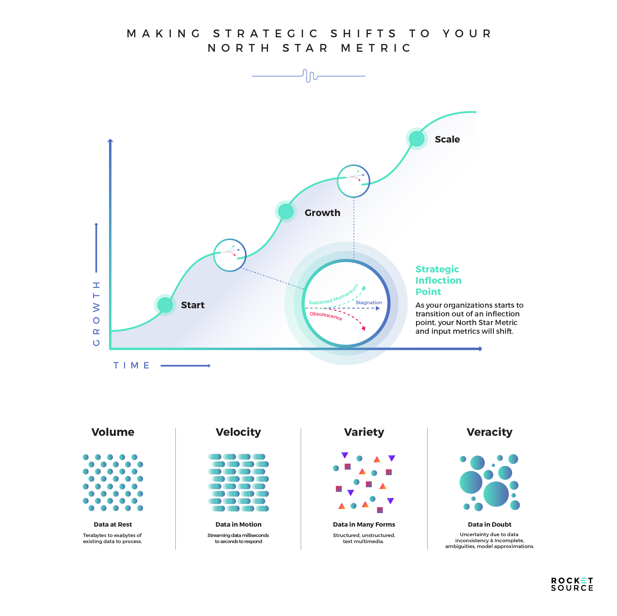
Sometimes, this transition into a new constellation can look a little scary. There are risks involved with every transition. For example, leadership changes could disrupt the way things are run, shifting how those goals are met and the speed or quality at which the tasks are performed. Lagging indicators could come up and make it harder to forecast new goals. And sometimes, decision-making can become more of a knee-jerk reaction rather than deep analysis.
Still, there are benefits to making strategic shifts, even when they feel hard.
Often, companies end up growing revenues and profits as they take on the next step on the S Curve of Growth. That’s because everyone on the team is focused on more specific North Star Metrics towards the new goal, so they’re working in unison to get to where they need to go.
When a team starts learning how to talk the talk and walk the walk of data-driven decision-making, and cultures shift to be more data-driven experimentation, then you can start to see products beginning to flourish as a result of specific North Star Metrics. In addition, agile meetings start to take on more of a growth cadence rather than simply looking surface level at what’s immediately necessary. The potential for growth on that next iteration of the S Curve gets amplified and becomes more predictable.
So, How Do You Develop Your North Star Metric?
Every time we help our clients optimize their input metrics, North Star Metrics, and North Star Goals, we do so through the lens of StoryVesting and the other frameworks I’ve developed over the past 30 years. These frameworks have proven to be instrumental in driving repeatable outcomes.
Remember, core behavioral research always, always starts with the Bow Tie Funnel. As we go through the Bow Tie Why LTV exercise I showed you above and list all of the reasons someone stays, we’re able to segment those reasons based on emotional or logical reasoning and at each stage of the journey. With that in hand, we can prioritize which areas are most important in relation to the competition, current offers, and more while infusing data that supports sticky LTV micro-moments rather than supporting only the acquisition portion of the funnel.
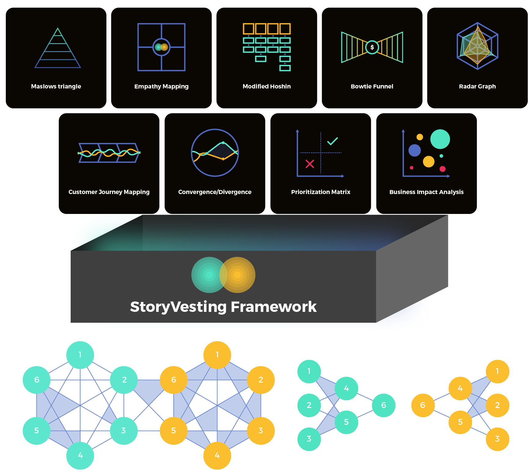
Start by working with a single emotional driver that drives home that LTV set of inputs for the cohort you’re going after. Also, remember that driver (as well as those metrics) may change as your business changes, new competitors enter a field, new tech is initiated, or as you target more cohorts. If you end with nine different emotional to logical drivers, eight different North Star Metrics, twenty different input metrics, I guarantee you that something will be amiss and you’ll be frustrated as hell. If you have more than one, you’ll need to go through and re-prioritize each of the reasons why someone stays based on the StoryVesting journey from the CX side.
Having said that, we do the hard work of finding those isolated values by reiterating on a slew of data: Why/How/When/Where does your customer move from emotional to logical decision-making? What does that ripple effect look like with your data in motion? What happens when they end up at a hybrid emotional and logical state at the time of purchase? Does it drive toward LTV? What emotional set of drivers can be replicated post-purchase without being trite or brand dilutive? Which friction point has the highest impact on CAC:LTV or CX[insert any ratio that is directly attributable to CX intiative]:LTV. I think you get the point here as I coming to the final stages of this post. Business is messy, as I said.
With these inputs and metrics solidified and endorsed by your team, it’s time to go get some client-facing data. This data should simply reinforce your values and actions that drive toward the North Star Metric. It does not mean you’re going to go and ask what they think about your North Star Metric. Instead, it means that you’ll have conversations with your customers that will reinforce those critical metrics. Being able to really have quality face-to-face conversations is ideal. Focus group surveys tend to lead to dirty data thanks to cognitive group think. You can do better, and you don’t have to do it on a massive basis to gather really good data. You can start small, with about 30-40 of your clients, moving towards an end goal to ultimately achieve n200 client-facing qualitative data inputs annually.
With the data in hand, you can then align the Bow Tie Funnel why on the BX side, circle by circle, side by side, stage by stage. Then go through the same process on the CX side. Reprioritize your data based on StoryVesting alignment and then test, learn, share, and repeat.
Ultimately, when you get your North Star Metric, it’s going to stay with you until your next switchback, pivot, or place along your S Curve of Growth.
Don’t Let Finding a North Star Metric Scare You
I’ll be the first to admit that I worry about presenting big data initiatives like this across our team and to our clients. That’s because it can feel a bit overwhelming. Still, I do it because it matters that much.
Knowing how to think about metrics, solve for critical metrics like the North Star Metric, and build processes that give your teams confidence in making decisions is so critical to our team. It is critical to your teams’ and business’s success, too. Everyone wants to make an impact in their company and a North Star Goal and a single or set of North Star Metrics can quickly align a very fragmented culture.
Using these frameworks to find and/or optimize a proper North Star Metric initiative can feel tedious and hard, but it doesn’t have to be. We’re here and available to do a complimentary assessment and North Star Metric consultation for your team. Connect with us and continue moving your organization forward towards an impactful means of working with your metrics.
Schedule Your Complementary North Star Metric Consultation